


You are now leaving our website and entering a third-party website over which we have no control.
Welcome to the TD Active Trader User Guide!
Here you will find tutorials on the numerous tools (widgets) available.
To help make navigation simple, it's organized the same way as the platform itself. Find instructions on widgets under the same dropdown menus you find them on TD Active Trader.
Select a topic to view
Let's Get Started
LAYOUT. Learn how to navigate the platform.
The platform is divided into three sections: Header, Workspace and Order Entry Tool.
HEADER. Find platform menus and account info.
Here you will find most of the tools, information and menus needed to get you through your trading day.

Add a widget - Click on a dropdown menu.
Next, click on or drag an item and drop it to a place into the layout.

Select active account - Click your account number to select which account to view (when applicable).

View balance summary – Find your account balances conveniently available in real-time, at all times.

View balance details - Click on any of the numbers in the header for a detailed view.

Customize balance summary – Click Header Customization.

Add any of the following metrics:
Total Account Value
Buying Power
Cash
Day P/L
Uncleared Deposit
Total Market Value
Stock Market Value Long
Stock Market Value Short
Option Market Value Long
Option Market Value Short
Est. Portfolio Cost
Open P/L
YTD P/L
Commission YTD

Hide/unhide account information – Click Privacy to toggle this feature on/off.

View market data subscriptions - Click Market Data to see which quotes are in realtime or delayed.

Contact us – Click the Support icon for contact information.

Start Chat – Click to chat with us directly within the platform.

Use CoBrowse – Click Enter CoBrowse ID when prompted for live support.

Then enter the service number given.

Read notifications – Click the Notifications icon.

Manage layouts – Click the Layout icon.
Click to Save, Load or Restore layouts to default.

Adjust platform settings – Click the System Menu icon.
Click to adjust application settings, notification settings, change theme, choose to show/skip order confirmation, view FAQs or log out.

Select default account – Click Application settings > General > Account.

Show icons in widgets – Click Application settings > General > Display.

Set order defaults for Stocks – Click Application settings > Order Defaults > Stock.

Set order defaults for Options - Click Application settings > Order Defaults > Option.

Adjust notification settings – Click Notification settings to enter contact details and select what items to be notified of.

Change colour theme – Click Change theme to choose between Dark or Light colour themes.

For illustrative purposes – Dark theme.

For illustrative purposes – Light theme.
WORKSPACE. Customize this area and analyze the markets your way.
TD Active Trader comes equipped with widgets already arranged for you. You can add/remove widgets and rearrange them at any time.
You can also build your own workspace from scratch. Create multiple workspaces with different functions to help organize your trading day even further.

Add a widget - Click on a dropdown menu.
Then click on or drag an item and drop it to a place into the layout.

Each menu holds the following widgets:
Account - Account Overview, Account Statement, Orders, Positions, Trade History, Trade Journal and Messages.
Trading - Charts, Watchlist, Option Chain, Market Depth, Trade Ladder and Time & Sales.
Tools & Analysis - Alerts, Risk Profile, Company Profile, Screener, Earnings Analyzer and Notes.
Markets - News, Calendar and Heat Map.
Learn - Education Center and Video Lessons.

For illustrative purposes – above shows the Watchlist, Market Depth, Charts and Orders widgets being added.
Move widgets – Click and hold on the Drag icon in the upper-left area of each widget.

Drag and release it when the highlighted area is in the position you're looking for.


For illustrative purposes – above shows the Watchlist widget being moved below the Market Depth widget.
Resize widgets – Drag the highlighted bar between widgets.


For illustrative purposes – above shows the Charts widget being resized.
CUSTOMIZE WIDGETS. All widgets have interactive icons in the upper-right area.

Common widget icons are:
Add widget – keep your current layout while adding another widget that you can toggle between.
Autoresize – adjust all column widths to fit data.
Detach widget – duplicates widget in a separate window.
Widget menu – find main settings such as columns customization and manage templates.
Collapse all – quickly collapse all open rows of expandable data.
Expand all – quickly expand all collapsed rows of expandable data.
Close widget – remove the widget from your workspace.
Link widget – all tools with the same colour will display the same underlying symbol.
LINK WIDGETS. Click the Link icon in the upper-left area of a widget and select a colour group.

Results: Anytime an active symbol is changed, all widgets will reflect the same symbol.

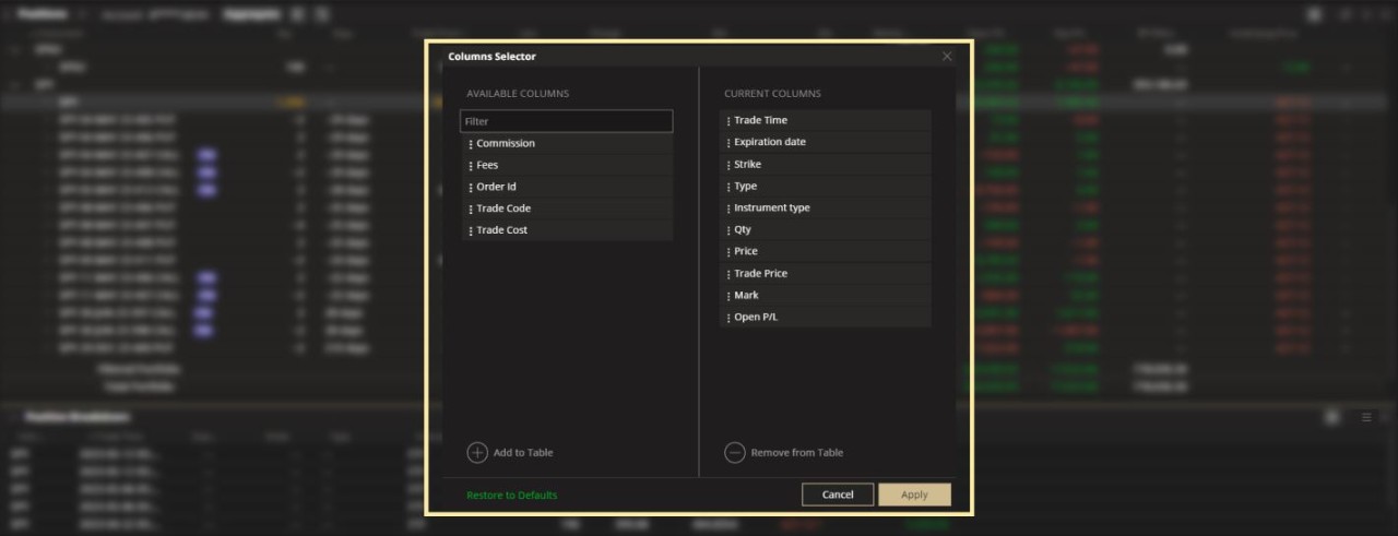
CUSTOMIZE WIDGET COLUMNS. There's a lot of data to look at (that's a good thing). For tools with data columns, pick and choose only what you need at any time.

Add columns - Click the Menu icon.
Next, click Columns Customization.

Click on as many metrics from the Available Columns list.
Click Add to Table in the lower left.
Click Apply when done.

TIP: You can also drag items from left to right.
Remove columns - Click on as many metrics listed in Current Columns.
Click Remove from Table in the lower right.
Click Apply when done.

SORT AND FILTER WIDGET COLUMNS. Organize and find information.
Sort column – Click on the Sort icon at the top of a column to cycle through not sorted, ascending or descending order.

Filter column – Click on the Filter icon at the top of a column to create your filter.

SAVE YOUR SETTINGS. Create multiple templates, upload at anytime.
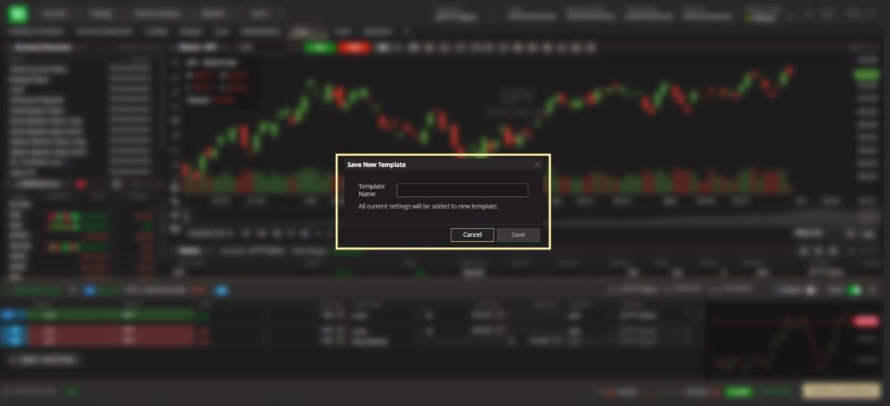
Save changes - Click the Menu icon.
Next, click Template Management > Save Current Template As.

Next, type in the template name and click Save.
Load changes – Click the Menu icon.
Next, click Template Management > (name of saved template).

ACTION MENU. Find actions that you can take with any symbol.
Show action menu – Right-click on a widget.

Common actions are:
Trade
Analyze
Add to Watchlist
Create Alert
Use Notes widget
Copy symbol
Get more info
CREATE MULTIPLE WORKSPACES. Build as many workspaces as you need.
Add a workspace – Click the Add icon next to your workspace tabs.

For illustrative purposes – below shows a fourth workspace being added.

Rename workspace - Double-click on the workspace tab.

Type in your new title and hit ENTER.

Duplicate, edit or close (delete) workspace - Click the Menu icon next to the workspace name and choose accordingly.

SAVE WORKSPACE LAYOUTS. Save all workspaces and widget customizations as a template.
Save workspace layout - Click the Layout icon.
Next, click Save Layout As...

Next, type in the name you want to save your layout as and click Save.

Load workspace layout - Click the Layout icon.
Next, click the name of the layout you want to load.

ORDER ENTRY TOOL. Build and edit orders without losing your place in the platform.
This tool is visible at all times, regardless of what workspace you're viewing. Expand or collapse it at your convenience. Prepare an order while you research and send it to market whenever you're ready to move forward with your trade.

CREATE AN ORDER. There are many ways to initiate an order. You can use the features in each widget (described their respective sections of this guide) or use the Order Entry tool directly (described below).
Create a single order – Enter the trade details manually.

Create order group – Click the Plus icon.

Next, select from one of the order groups.

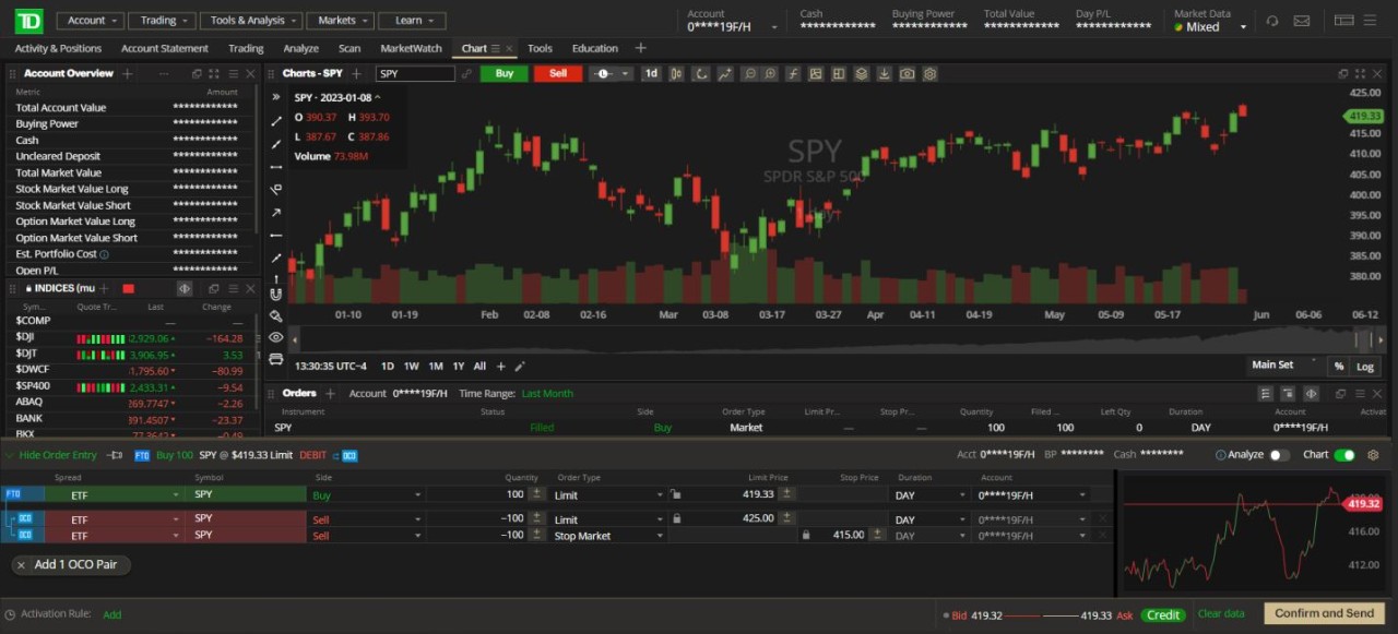
OCO – One Cancels Other
Two orders are sent to market. If one gets filled, the other is cancelled.

For illustrative purposes only.
Add 1 OCO Pair – First Triggers OCO (FTO)
A first order is sent to market. If it gets filled, then an OCO pair is sent to market.

For illustrative purposes only.
TIP: Click Add 1 OCO Pair again to add another OCO pair to your order.
First Triggers Sequence (FTS)
A first order is sent to market. If it gets filled, then the second order in the sequence is sent to market.
If that subsequent order is filled, then the next order in the sequence is sent to market. This repeats until the sequence is completed.

For illustrative purposes only.
TIP: Click Add 1st Triggers Sequence to add additional orders to the sequence.
First Triggers All (FTA)
A first order is sent to market. If it gets filled, then all subsequent orders listed are sent to market.

For illustrative purposes only.
TIP: Click Add 1st Triggers All to add additional orders to the list.
Add activation rule – Click Add (lower left area) to automate your trade.
Next, choose conditions to be met before TD Active Trader sends your order to market for you - whether you're in front of the screen or not.
Click Add (lower right) when done.

Edit order – Point and click on the arrows in a field or type in the information directly.

TIP: Use the price slider in the bottom area to quickly adjust price to current market quotes.
Submit order – Click Confirm and Send.

Next, review order confirmation. Click Go Back (to cancel) or Agree and Send (to proceed).

Analyze – Turn this feature on to send the order to the Risk Profile widget instead of sending it to market (see the Risk Profile section in this user guide for further instructions).
The order is indicated as Planned and the Confirm and Send button is removed.
Click Analyze to proceed.

Quick chart – Toggle this feature to show/hide an intraday chart of the stock's performance in recent months (zoom in/out by hovering and using the pop up buttons or your scroll wheel).

For illustrative purposes – above shows the quick chart visible in the right section of the Order Entry tool.

For illustrative purposes – above shows the quick chart removed from the Order Entry tool.
Adjust order defaults – Click the Menu icon to customize your order template.

Show/hide Order Entry tool – Click Order Entry to manage your screen space.


View pending order details – See the details of your constructed order without having to expand the tool.

Now that you understand the basics, let's look at all the different widgets designed to help you navigate the markets your way.
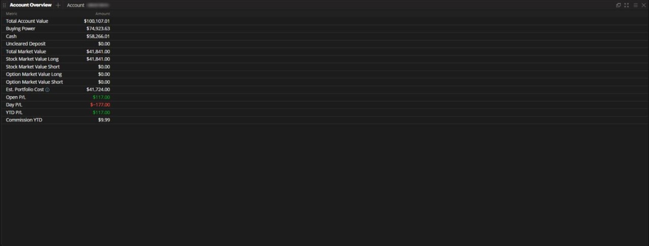
ACCOUNT OVERVIEW. Find key account metrics.
The Account Overview is a dedicated display of vital account metrics such as the overall Total Account Value, Buying Power or YTD P/L to name a few.
TIP: You can also find these account metrics at any time by clicking on the account balances in the Header section.

Customize metrics – Click the Menu icon.
Next, click Metrics customization.

Choose from the following metrics:
Total Account Value
Buying Power
Cash
Uncleared Deposit (see FAQ for more information)
Total Market Value
Stock Market Value Long
Stock Market Value Short
Option Market Value Long
Option Market Value Short
Est. Portfolio Cost
Open P/L
Day P/L
YTD P/L
Commission YTD

ACCOUNT STATEMENT. Keep track of account activity.
Tracking your cash movement, trade history or any account activity is vital for every trader. The Account Statement is here to help you manage just that. View a specific time range and filter by transaction details to find the information you need.
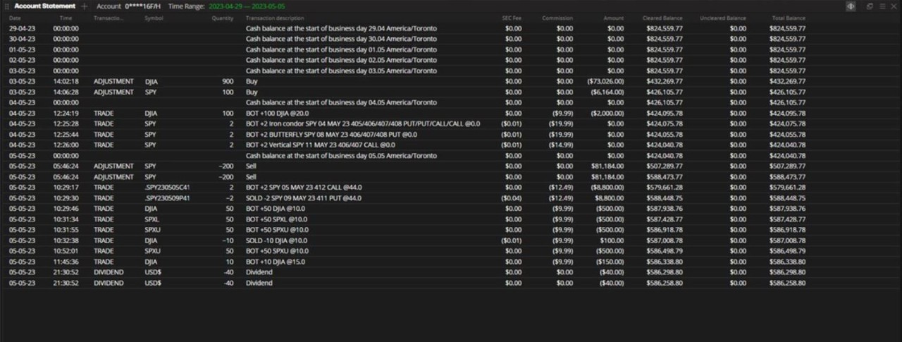
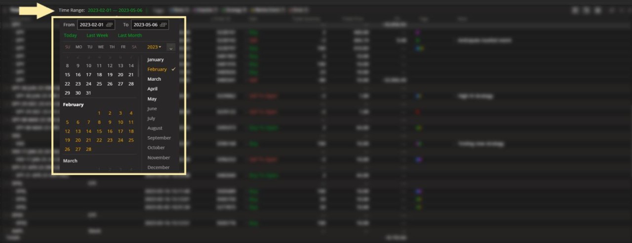
Define time range – Click Time Range and choose from:
Today
Last Week
Last Month
All History
Custom range (type in the Dates directly or click on the Calendar tool)

Filter by transaction type – Click the Filter icon then select the transaction type you're looking for.

Customize columns – Click the Menu icon.
Next, click Columns Customization.

Choose from the following metrics:
Amount
Cleared Balance
Commission
Date
Quantity
SEC Fee
Symbol
Time
Total Balance
Transaction ID
Transaction Description
Transaction Type
Uncleared Balance

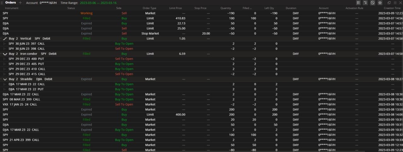
ORDERS. Manage current orders and research historical orders.
Find the status of your orders here. For working orders, modify or cancel them as needed. For filled, cancelled or expired orders, create Duplicate or Opposite orders.
Define time range – Click Time Range and choose from:
Today
Last Week
Last Month
All History
Custom range (type in the Dates directly or click on the Calendar tool)

Cancel or modify working orders – Right-click on a working order and choose Modify or Cancel Order.
TIP: Click the X icon to the far right to cancel an order.

Create duplicate or opposite orders – Right-click on any order status and click Duplicate or Opposite Order.

Customize columns in Orders section – Click the Menu icon.
Next, click Columns Customization.
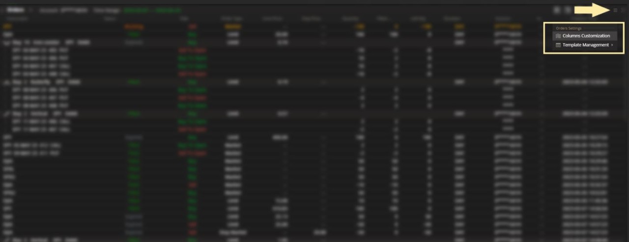
Choose from the following metrics:
Account
Activation Rule
Avg Price
Commission
Creation Time
Duration
Expiration Date
Fill/Cancel Time
Filled Qty
Instrument Type
Left Qty
Limit Offset
Limit Offset %
Limit Price
OCO
Option Type
Order ID
Order Type
Side
Spread
Status
Stop Offset
Stop Offset %
Stop Price
Strike
Symbol
Triggered By
Quantity

POSITIONS. Track and manage your current holdings.
View key metrics that help you understand how your positions are performing. Find a breakdown of a current position or create orders to manage your portfolio further.
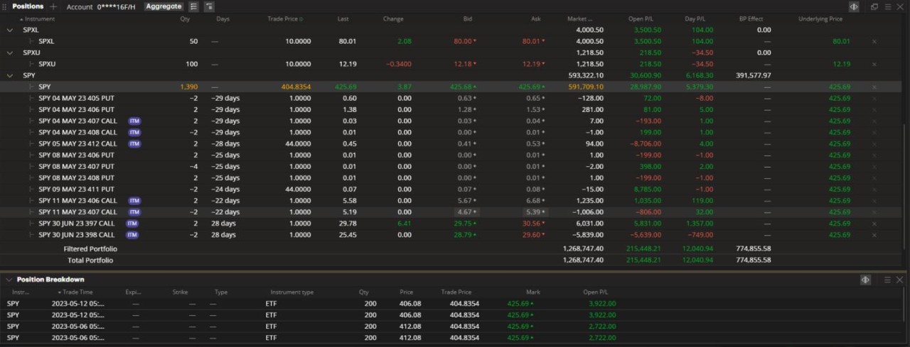
This widget is broken down into to sections – the Position Book and the Position Breakdown.
POSITION BOOK. Manage your open positions.

Sort using Aggregated Columns – Click Aggregate in the upper-left area to organize your positions using the available columns.

Next, choose the order that your positions should be listed by.

For illustrative purposes – in the above example, the selected order of positions is by Underlying, then by Spread (middle). In the Position Book (left), you can see all SPY positions are grouped together, then organized by Spread type.
Sort using Arrangements – Arrange positions by Instrument, Trade Time or Order.

For illustrative purposes – in the above example, the selected order of positions is by Order (middle). In the Position Book (left), you can see all SPY positions are grouped together, then organized by the Order (trade) they were entered in by.
View Buying Power Effect – View the BP Effect column to see how much BP each underlying position is leveraging.

For illustrative purposes – in the above example, the BP Effect column applies to all SPY holdings combined.
Use Explain Margin tool – Right-click on a position and click on Explain Margin for a breakdown of how positions are being paired for margin purposes.

A separate pop-up window will explain the BP Effect and Margin Required for each of the paired positions.

For illustrative purposes – in the above example, a short call was paried with a long position in the stock to allow for greater leverage of Buying Power.
Customize columns in Explain Margin – Click the Menu icon.
Next, click Columns Customization.

Choose from the following metrics:
BP Effect
Expiration Date
Instrument type
Margin Required
Quantity
Side
Strategy
Strike
Symbol
Type
Underlying

Close or Roll a position – Right-click on a position and click Close with Limit Order or Rolling Order.
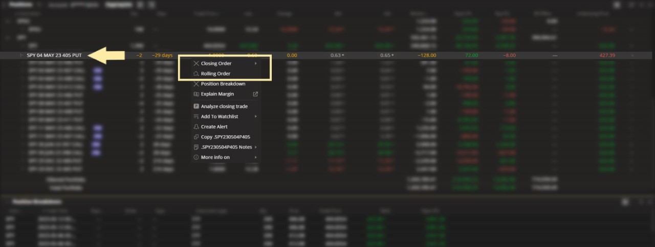
TIP: Hold CTRL on your keyboard to select multiple positions.
Customize columns in Position Book – Click the Menu icon.
Next, click Columns Customization.

Available columns include:
General Fields
% Change
Account
Ask
Avg Fill Price
Bid
Change
Contract Size
Days
Description
Expiration Date
Insturment Type
Intrinsic Value
Last
Mark
Mark Change
Market Cap
Market Value
Multiplier
Qty
Side
Spread
Strike
Symbol
Theo Price
Type
Underlying
Underlying Price
Volatility **
Greeks
Delta **
Gamma
Position Delta
Position Gamma
Position Rho
Position Theta
Position Vega
Rho
Theta
Vega
Margin
BP Effect
Profits and Losses
Day P/L, acc
Intrinsic P/L
Open P/L, acct
Theo P/L
**Note: The method of deriving the implied volatility and Delta for Equity, ETFs and Index options employs the market standard approaches, namely Black-Scholes model for European options and Bjerksund-Stensland model for American options.
It has its own proprietary approach to derive the model inputs based on the market's risk-free rates, dividends and observable option prices.

POSITION BREAKDOWN View the individual fills that make up your current position.

Select a position - Click on any position to view the individual fill quantities and prices.

For illustrative purposes – in the above example, a position of 1390 shares is broken down by the individual fills that make up the position and prices that make up the average fill price.
Customize columns in Position Breakdown – Click the Menu icon.
Next, click Columns Customization.

Available columns include:
Avg Fill Price
Commission
Expiration Date
Fees
Instrument type
Mark
Open P/L, acc
Price
Qty
Strike
Trade Code
Trade Cost
Trade Time
Type
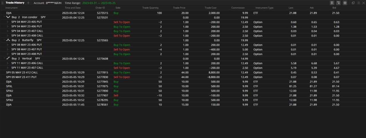
TRADE HISTORY. Find details on current and historical trade fills.
Here's a fast way of finding details on a filled trade. Customize the columns on your screen to filter the information you want.
Define time range – Click Time Range and choose from:
Today
Last Week
Last Month
All History
Custom range (type in the Dates directly or click on the Calendar tool)

Find trade by instrument - Use the Sort and Filter functions at the top of each column.
NOTE: Option spread orders will show fills on each leg as a group. Individual legs cannot be separated in this widget.

Customize columns – Click the Menu icon.
Next, click Columns Customization.

Choose from the following metrics:
Account
Ask
Bid
Commission
Fees
Instrument Type
Last
Order ID
Side
Symbol
Time and Date
Trade Code
Trade Cost
Trade Price
Trade Quantity

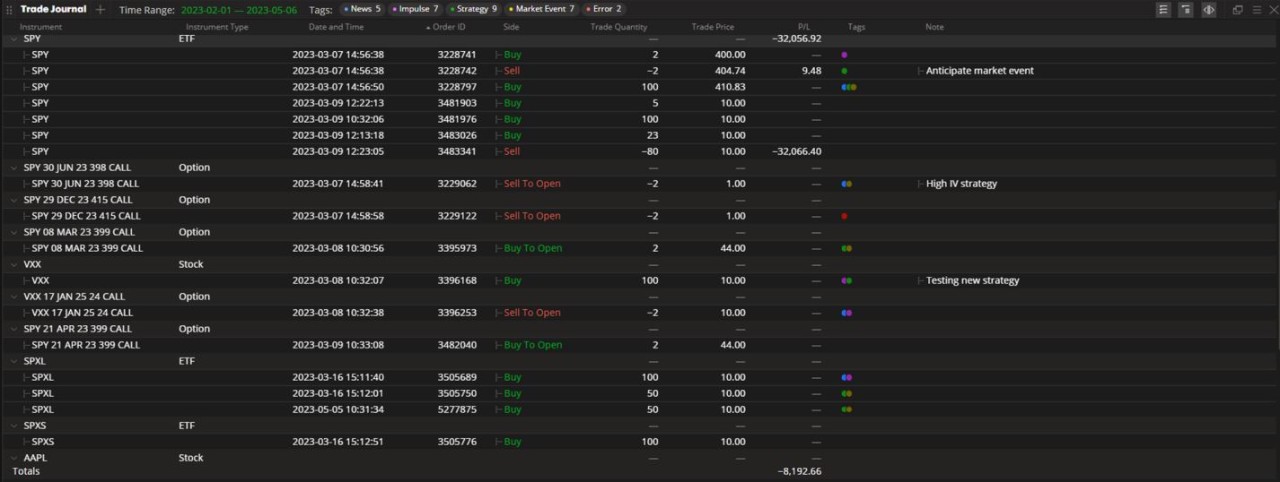
TRADE JOURNAL. Pair the thoughts behind your trade ideas with their outcomes.
There are many benefits to journaling. For investors, it can help with clarity, critical thinking and even heighten performance.
Use this widget to observe your trading history, categorize the motivation behind each decision and add notes for future review.
Define time range – Click Time Range and choose from:
Today
Last Week
Last Month
All History
Custom range (type in the Dates directly or click on the Calendar tool)
TAGS. Label the motivation behind each investment decision.

Add a tag - Click on the Tags column of the trade you wish to label.

Next, choose from:
News
Impulse
Strategy
Market Event
Error

Remove a tag - Click on the Tags column of the trade you want to manage.
In the pop-up box, click on the tag you want to remove.

NOTES. Add notations to a trade and use it as reference.
Add a note - Click on the Note column of a trade.

Next, enter your text in the pop-up window and press CTRL + Enter to submit.

You can also click the Expand icon in the top right to create a larger pop-up window.
Press Cancel or Submit to proceed.

Delete or edit a note - Hover over the text and choose Edit.
Next, delete or replace text and press CTRL + Enter to submit.

Customize columns – Click the Menu icon.
Next, click Columns Customization.

Choose from the following metrics:
Account
Date and Time
Instrument Type
Note
Order ID
P/L
Side
Symbol
Tags
Trade Code
Trade Price
Trade Quantity

MESSAGES. Find the content of pop-up messages that you may not have had the chance to review.
In this widget you will find order notifications, triggered alerts, margin call alerts or messages sent to you directly from our admin team.
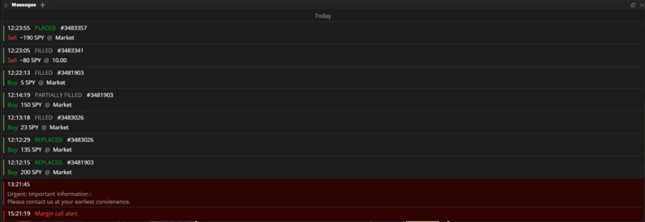
Messages will appear in descending order of the time it was received.

A separator will show the date when the following messages were generated.

CUSTOMIZATION. There are no further sorting or customization abilities on this widget.
Navigating the Charts widget
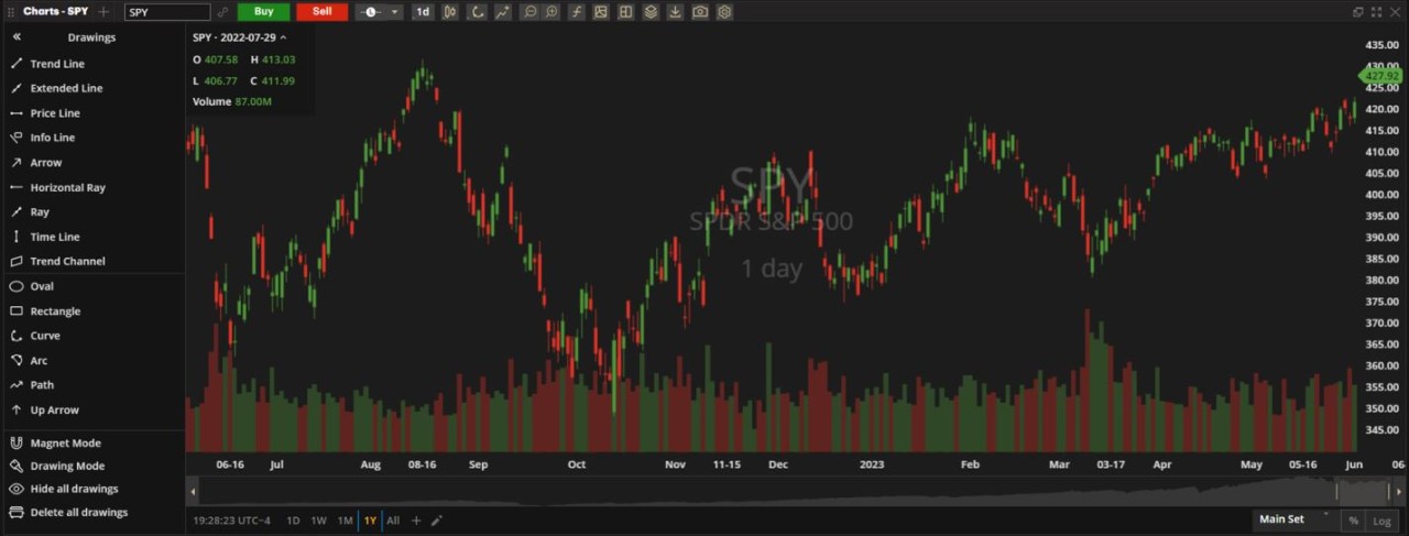
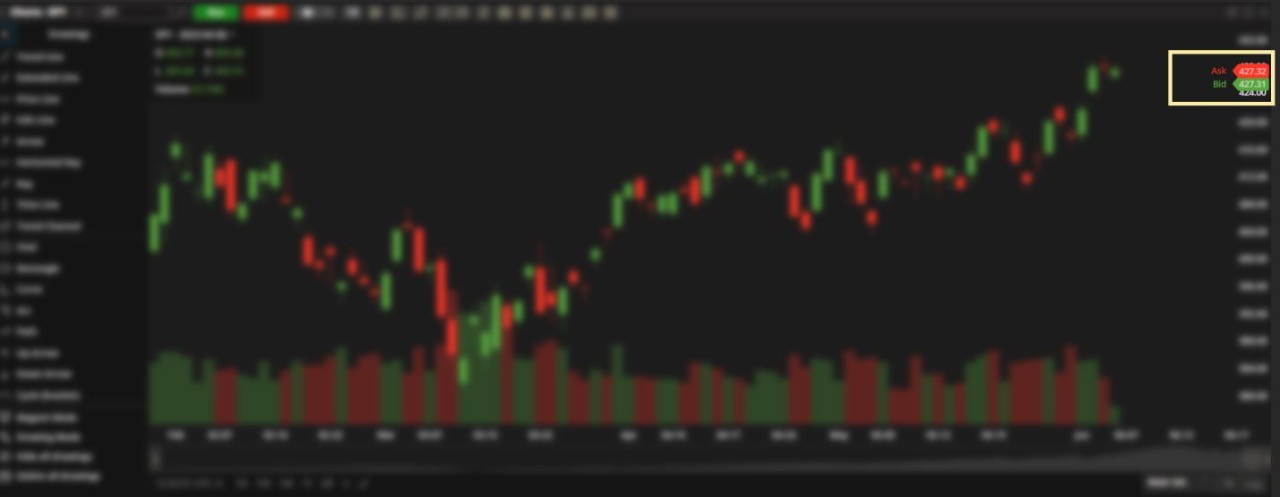
CHARTS. Visualize price action and analyze trade ideas.
The Charts widget provides you with a visual story of a symbol's price action over time and has hundreds of technical indicators and studies to help you find your next entry and exit points.
Enter a symbol – Type in a symbol to get started.

Initiate an order – Click the Buy/Sell Buttons.
Note: Click the dropdown to set the default to a Limit (L) order or a Stop (S) order.

Choose aggregation period – Click the Aggregation Period icon.
Next, define what each bar/plot on the chart represents.

Create a custom aggregation period - Click Custom and define your own aggregation period.

Use Tick charts – Type in the number of ticks, followed by the letter "t".

The custom aggregation period appears at the top of the list.
Delete a custom aggregation period – Click the X icon next to the period you want to remove.

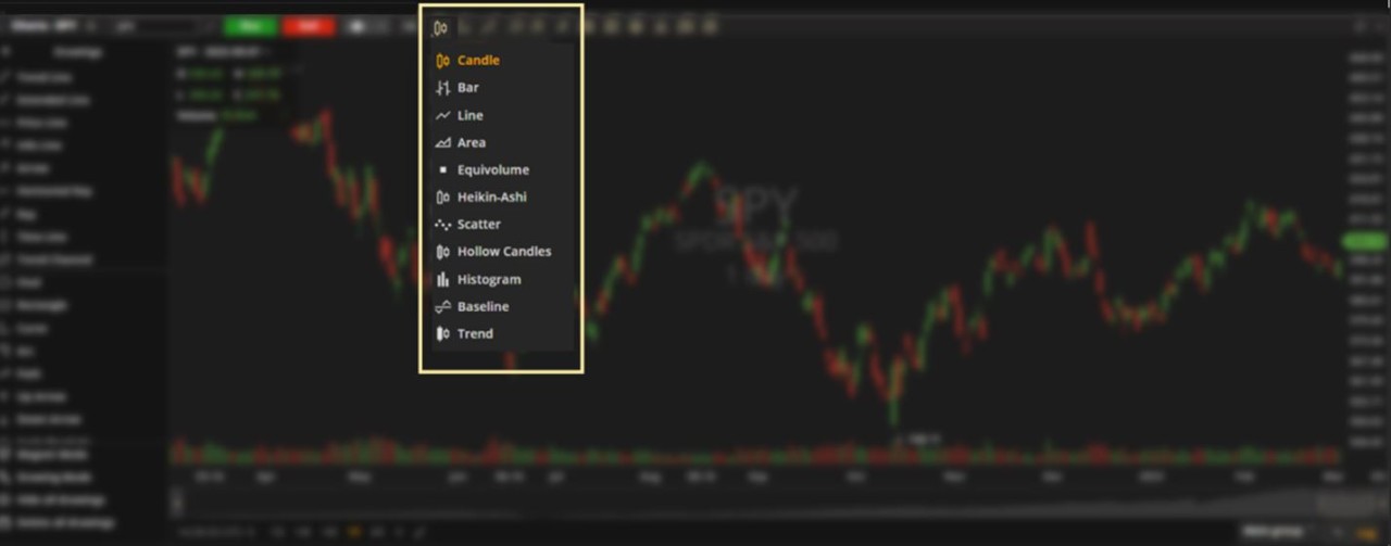
Select chart type – Click the Chart Type icon.
Choose from the list (see the Chart Types section in this user guide for more information).
Add drawings – Click the Drawings icon.
Scroll down the list and select a drawing to add to your chart (see the Drawings section in this user guide for more information).

Compare charts – Click the Compare Charts icon.
Enter symbols to compare price performance on one chart.

Edit comparison lines - Click the Settings icon or Delete icon in the information box to the left.

Zoom in – Click the Zoom In icon.
Zoom out – Click the Zoom Out icon until your timeframe is restored.
Left-click to start highlighting an area of the chart to zoom into.
Left-click again to complete your selection.
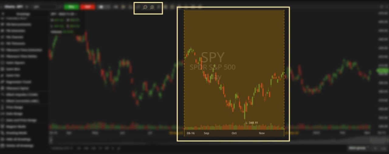
TIP: You can also drag the left and right margins (bottom right corner) to capture a specific timeframe on the chart.

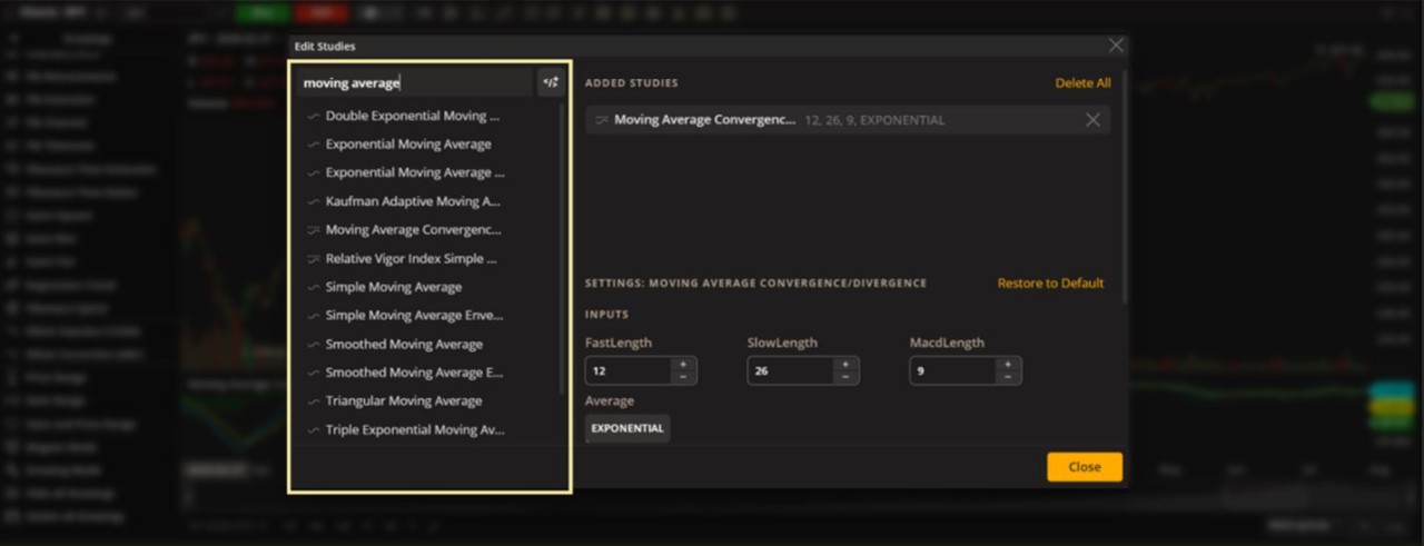
Add a study – Click the Studies icon and the Edit Studies box will appear.

Enter the name of a study or scroll down the list.
Next, double click a study from the list or drag it to the right.

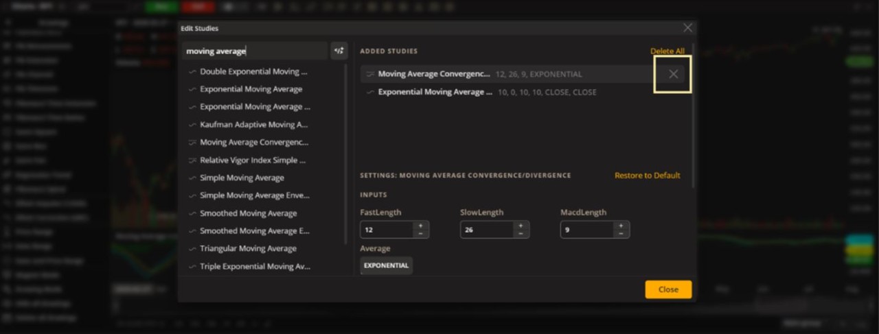
Delete a study – Click on any study in the Added Studies seciton.
Next, click the X icon to the right of the study.

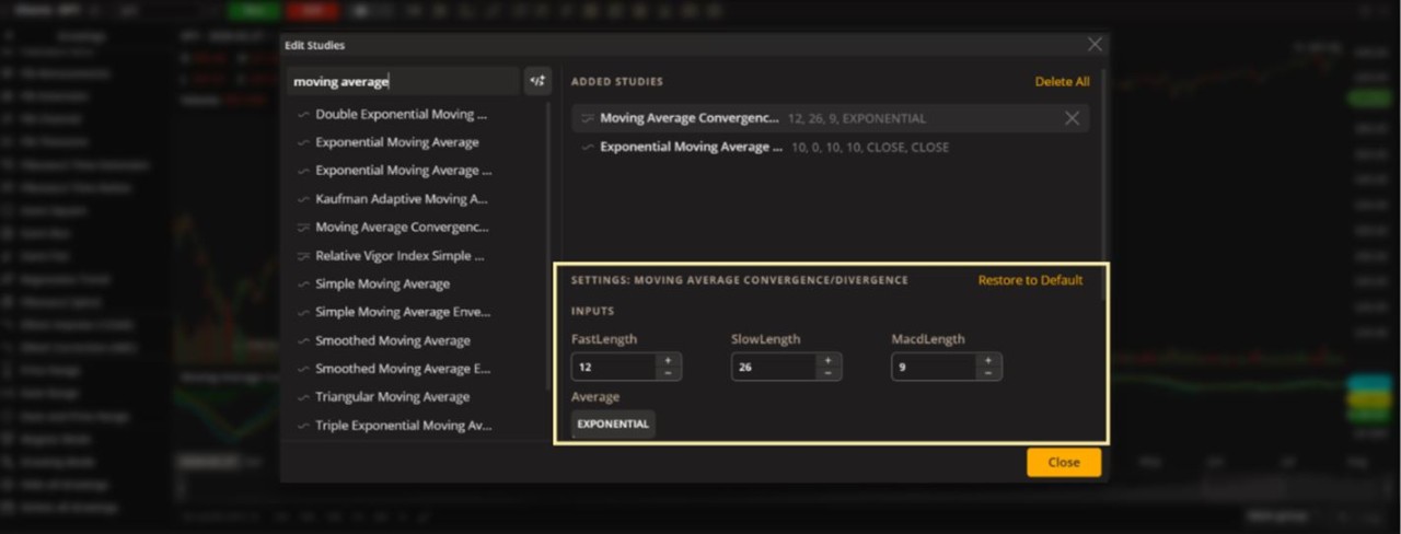
Edit a study – Click on any study in the Added Studies seciton.
Next, customize the parameters or click Restore to Default to revert to the original settings.

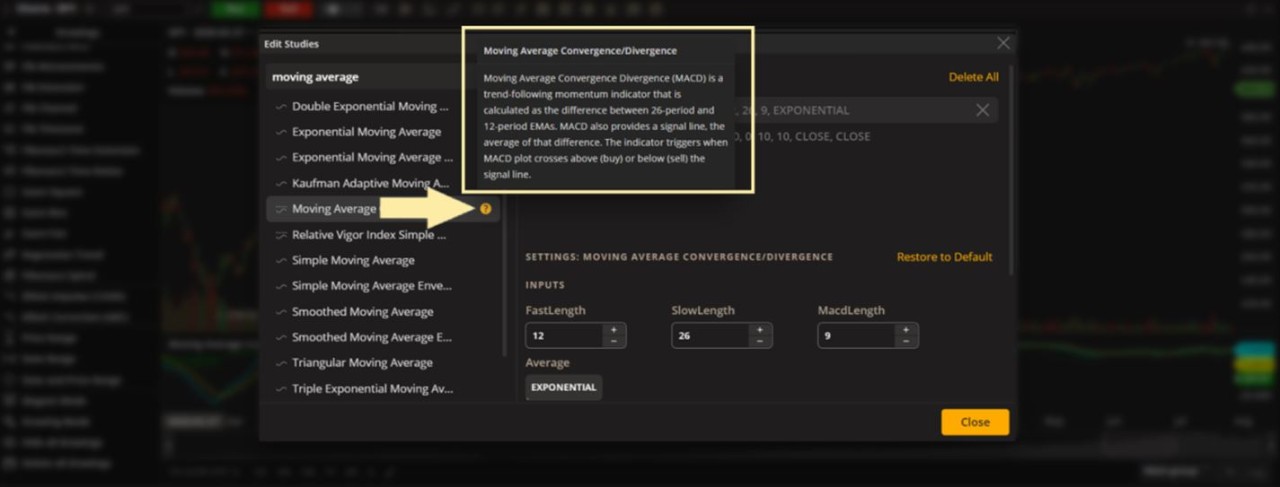
TIP: Find a full description of a study by hovering over it and clicking the Help icon.

Save drawing sets - Click the Save Indicator Templates icon and type in the template name (in this example, 'For long-term trades' was used).
Edit or delete templates – Hover over a name and click the pencil icon (edit) or X (delete).

View multiple charts on one screen - Click the Multichart icon.
Next, under Chart Layout select a format.
Next, under Synchronize select which features you want synchronized across all charts.

Maximize chart (when viewing multiple charts) - Click on any chart to select it.
Next, click the Maximize icon to increase the size of that chart to the full screen.

Minimize chart - Click the Minimize icon.

Layers – Click the Layers icon.
This lets you show/hide specific groups of drawings at any time.

Create a group - Click Create group and drag drawing names accordingly.

Rename a group – Double click the group name.

Show/hide a group - Click the show/hide icon.

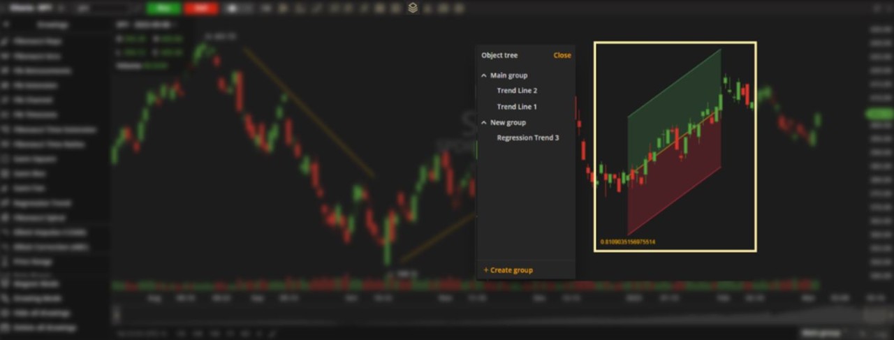
Lock/unlock a group – Click the Lock/Unlock icon.
TIP: Use the menu in the lower right for quick access to selecting, creating, renaming or deleting groups.

Export chart data – Click the Export icon to export the data points of each candle on your chart onto a spreadsheet.

Chart screenshot– Click the Snapshot icon to download or copy your chart image.

Chart settings – Click the Settings icon.
Next, choose from the list on the left.
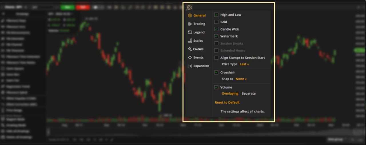
General

High and Low - Displays the highest and the lowest prices for the chosen instrument on the chart.
Grid - Displays a vertical grid on the chart.
Candle Wick - Displays candle wicks (for the candle chart types only).
For the Equivolume chart type, the setting is Show close prices.
Watermark - Displays a watermark with the name of the instrument in the middle of the chart.
Session Breaks - Displays a vertical grid marking the start/stop of each daily trading session.
Extended Hours – Displays the premarket and afterhours trading sessions.
Align Stamps to Session Start - Aligns chart data with the market session start. Data on the chart will be synchronized with the time the market opens.
Price Type - Price plotted on the chart. Choose from Last (the last price a deal was made at the market), Market (the current available price at the market), Bid (highest bid price available at the market) or Ask (the lowest offer price available at the market).
Crosshair - Displays a crosshair on the chart. Here, you can choose what price the crosshair should be snapped to. The different chart types have diverse elements on them.
Volume - Displays additional volume bars.
Overlaying - There are two options available – Overlapping (displays additional volume in the same area as the chart) or Separate (displays additional volume in the study pane down below).
Trading

Show Orders - Shows all created orders on the price axis.
To cancel or modify an order on the chart, click the Order box, then the icons on each end.

Show Positions - Shows all the created positions on the price axis.
To close a position on the chart, click the Position box, then the icons on each end to Close (single order) or close with an OCO order.

Show Alerts - Shows all the created alerts on the price axis.
To cancel or edit an alert on the chart, click the Alerts box, then the icons on each end to Cancel or Edit the alert.

Legend (information box)

The Legend appears in the upper-left area of the chart.

Instrument Name - Show ticker symbol in the Legend box.
OHLC Values – Shows the Open, High, Low and Close of the time period on the chart you are hovering over.
Volume Value – Shows the number of shares traded during the time period on the chart you are hovering over.
Scales
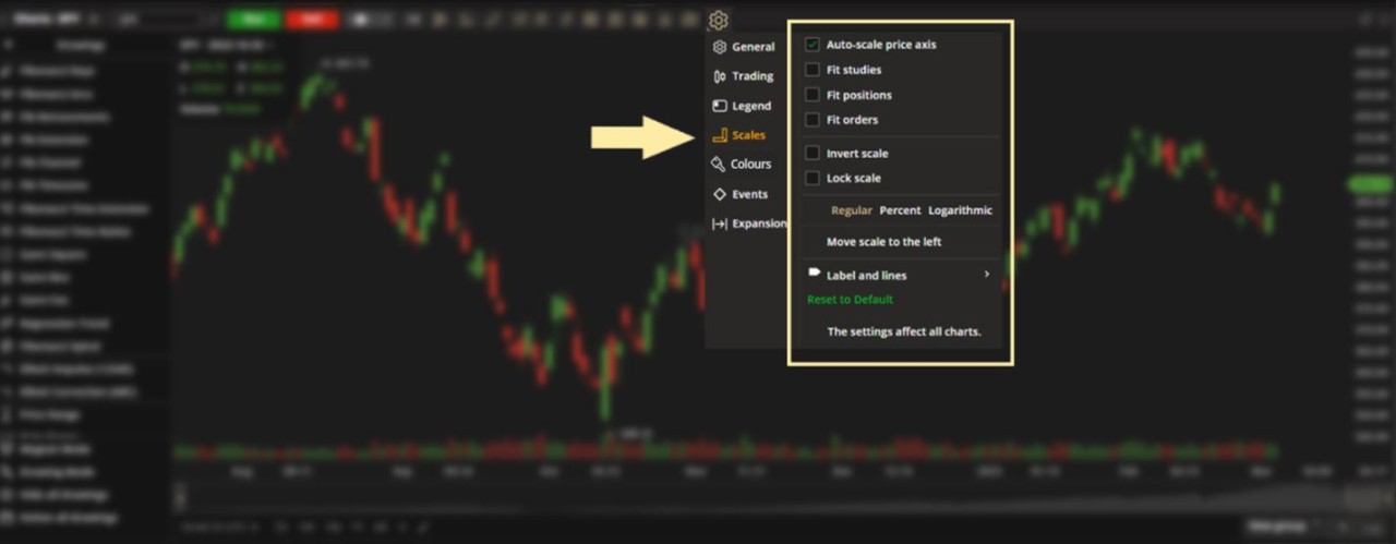
Auto-Scale Price Axis – Scales the price axis to fit all elements selected below (Studies, Positions or Orders).
Fit Studies – Scales the price axis to fit all studies being used.
Fit Positions – Scales the price axis to fit your current positions (holdings) for this symbol.
Fit Orders – Scales the price axis to fit all orders for this symbol.
Invert Scale - Inverts the direction of the price axis.
Lock Scale – Keeps the scale of price and time when you zoom in/out the charts.
Types of price scales:
Regular – A linear price scale where the prices are positioned equidistantly (equally far away) from one another.
Percent - Prices are shown in percentage instead of points.
Logarithmic - A logarithmic price scale where the prices are positioned not equidistantly (not equally far away) but accordingly to a percent change between them.
TIP: Click the shortcuts in the lower right of the chart to cycle through the different price scales.
Move Scale To The Left – Displays the price axis on the left side of the chart instead of the right side.

Labels and Lines – Marks your selected data points with a label in the price axis or a line across the chart.


Price Labels.

Price Lines.
Descriptions – Adds text to the labels or lines in the price axis.
Price Descriptions.
Countdown to Bar Close - Shows a bar's lifetime on the price axis.
TIP: Right-click on the price axis and see this as a pop-up menu.

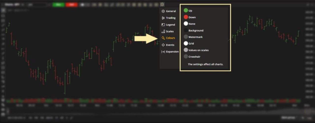
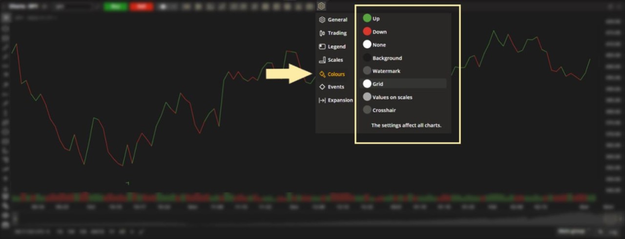
Colours

Colours – Changes the colours assigned to the different elements of your chart.
Events

Events on Chart - Displays info markers about upcoming events on the time axis. Choose to mark:
Dividends
Splits and Consolidations
Earnings and Estimates
Conference Calls
Expansion (the blank space on the chart)

Top Margin – Adjusts margin between 0% and 30%.
Right Margin – Adjusts margin up to 999 bars.
Bottom Margin – Adjusts margin between 0% and 30%.
DRAWINGS MENU. Scroll down the list and click on an icon to activate the drawng tool (see the Drawings section in this user guide to learn more about each tool).
Show/hide – Click the arrow to manage your screenspace.


TIP: When the drawings menu is hidden, hover over a drawing tool for a quick description.
Add drawing to favourites – Click on the Star icon next to the drawing to add it to the top of the list.

Remove drawing from favourites – Click the Star icon that appears next to each name to remove it from favourites.

Magnet Mode – Click this to snap drawings to the nearest candle element (Open/Close/Low/High).

Drawing Mode – Click this to continuously create the selected drawing without having to re-select the tool every time.

Hide all drawings – Click this to hide/unhide all drawings on the chart temporarily.

Delete all drawings – Click this to remove all drawings from the chart permanently.

Edit/delete a drawing – Click on a drawing and use the pop-up toolbar. Customize colour, line width and parameters.

CHART SPACE.
Action menu – Right-click anywhere on the chart to take any of these actions.

Select timezone – Click to adjust the local timezone displayed on your chart.

Select time range displayed – Click to select the range of time displayed on your chart.

Add custom time range – Click the Plus icon.

Next, select your aggregation period and date range then click Save.

Remove custom time range – Click the Pencil icon.

Next, hover over your selecton and click the X icon.
Click the Checkmark icon when done.

CHART TYPES. The following section describes the different chart types available to help you analyze price action.
CANDLE. Shows Open, High, Low and Close.
The wide candle helps make the price movement more visible.

How to read a Bullish (green by default) and Bearish candle (red by default).
Colour is based on the Open and Close of the current aggregation period.
Customize colours – Click the Settings icon in the upper menu bar, then Colours in the left column.

Algorithm
Bullish Body - Close price > Open price (green by default)
Bullish Border - Close price > Open price (green by default)
Bearish Body - Close price < Open price (red by default)
Bearish Border - Close price < Open price (red by default)
Doji - Close price = Open price (white by default)
BAR. Shows Open, High, Low and Close.
Bars are more visually compressed than Candle charts.
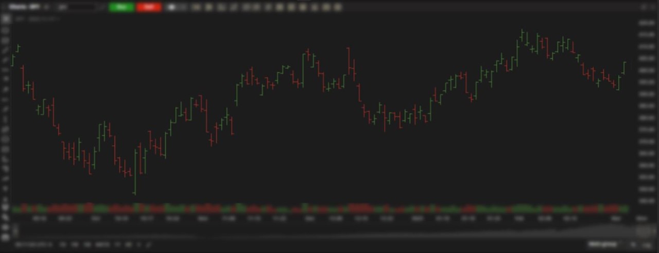
How to read a Bullish (green by default) and Bearish bar (red by default).
Colour is based on the current Close vs. the previous Close.
Customize colours – Click the Settings icon in the upper menu bar, then Colours in the left column.
Algorithm
Up - Current Close > Previous Close (green by default)
Down - Current Close < Previous Close (red by default)
None - Previous Close = Current Close (white by default)
LINE. Shows Close only.
Lines connect consecutive closing prices.
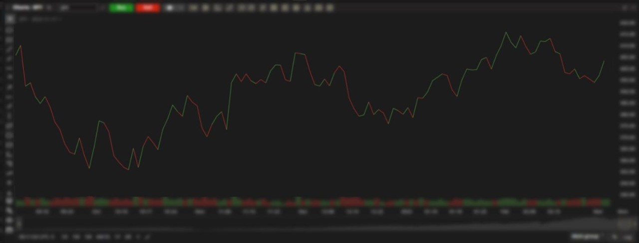
The colour of each connecting line is based on the current Close vs. previous Close.
Customize colours – Click the Settings icon in the upper menu bar, then Colours in the left column.
Algorithm
Up - Current Close > Previous Close (green by default)
Down - Current Close < Previous Close (red by default)
None - Previous Close = Current Close (white by default)
AREA CHART. Shows Close only.
Lines connect consecutive closing prices with no colour coding; uses shading for a clearer view of the trend.

Customize colours – Click the Settings icon in the upper menu bar, then Colours in the left column.

Algorithm
Area – The section of the chart below the Closing Price line (grey by default)
EQUIVOLUME. Focuses on Volume. Shows High, Low and Close only.
The wider the bar, the greater the volume traded in that aggregation period.
Each bar shows the High (top of the box), Low (bottom of the box) and Close (middle line inside the box).
The colour of the box is based on the current aggregation period's Close vs Open.
Customize colours – Click the Settings icon in the upper menu bar, then Colours in the left column.

Algorithm
Up - Close price > Open price (green by default)
Down - Close price < Open price (red by default)
None - Close price = Open price (white by default)
HEIKIN-ASHI. Means "average bar".
Since the average of the price movement is taken, the chart will have a smoother look than the traditional Candle chart.

A comparison between the Candle and Heikin-Ashi charts:

Candle chart

Heikin-Ashi chart
Customize colours – Click the Settings icon in the upper menu bar, then Colours in the left column.

Algorithm
Bullish Body - Close price > Open price (green by default)
Bullish Border - Close price > Open price (green by default)
Bearish Body - Close price < Open price (red by default)
Bearish Border - Close price < Open price (red by default)
Doji - Close price = Open price (white by default)
The Heikin-Ashi values are calculated as follows:
Open = (Previous Open + Previous Close) / 2.
A new candle opens at the midpoint of the previous candle.
Close = (Close + Open + High + Low) / 4.
The average between the Low, High, Open, and Close of the current candle.
High = The highest of the recent High, or Close values.
Low = The lowest of the recent Low, Open, or Close values.
SCATTER. Shows Close only.
With no connecting lines, it helps identify the correlation between two or more prices and identify outliers or data gaps.

It does not colour each plot based on a higher or lower Close vs the previous Close.
Customize colours – Click the Settings icon in the upper menu bar, then Colours in the left column.

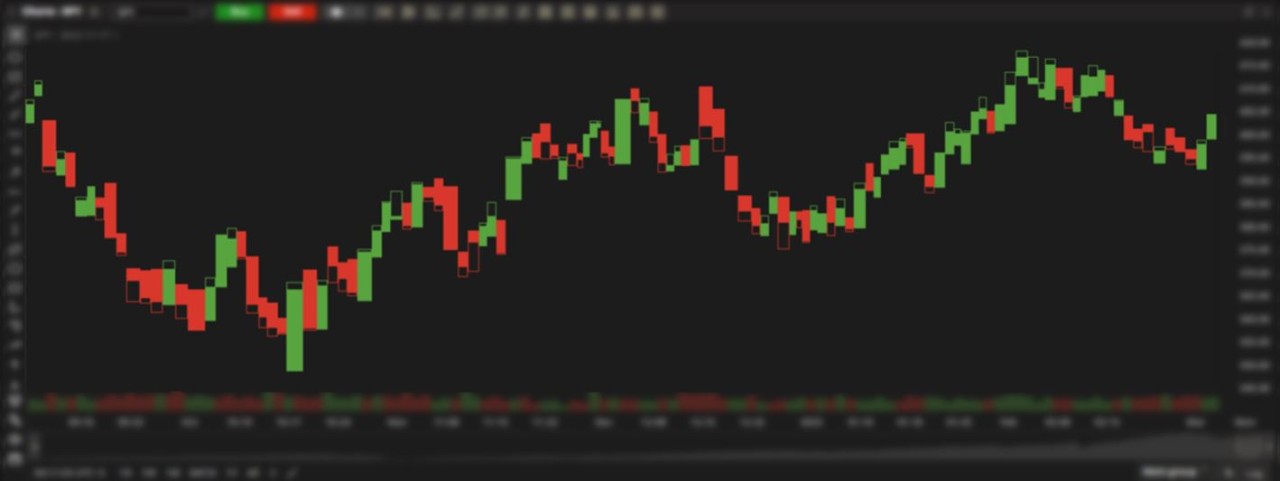
HOLLOW CANDLES. Shows Open, High, Low and Close.
Candles are hollowed and coloured in a way to help identify trends.

Candles are hollowed based on same period (current Close vs. current Open).
Candles are coloured based on previous period (current Close vs. previous Close).
A comparison between the Candle and Hollow Candle charts:

Candle chart.

Hollow Candle chart.
Customize colours – Click the Settings icon in the upper menu bar, then Colours in the left column.

Algorithm
Bullish Candle (Hollow) - Current Close > Current Open
Bearish Candle (Filled) - Current Close < Current Open
Colour
Bullish Body - Current Close > Previous Close (green by default)
Bull Border - Current Close > Previous Close (green by default)
Bearish Body - Current Close < Previous Close (red by default)
Bearish Border - Current Close < Previous Close (red by default)
Doji - Previous Close = Current Close (white by default)
HISTOGRAM. Shows Close only.
Each aggregation period is displayed and coloured as a series of columns to help visualize distribution peaks and patterns.

Customize colours – Click the Settings icon in the upper menu bar, then Colours in the left column:

Algrorithm
Bullish Body - Close price > Open price (green by default)
Bearish Body - Close price < Open price (red by default)
None - Close price = Open price (white by default)
BASELINE. Shows Close only.
Lines connect consecutive Close prices and displays a baseline (horizontal price line) that the trader selects.
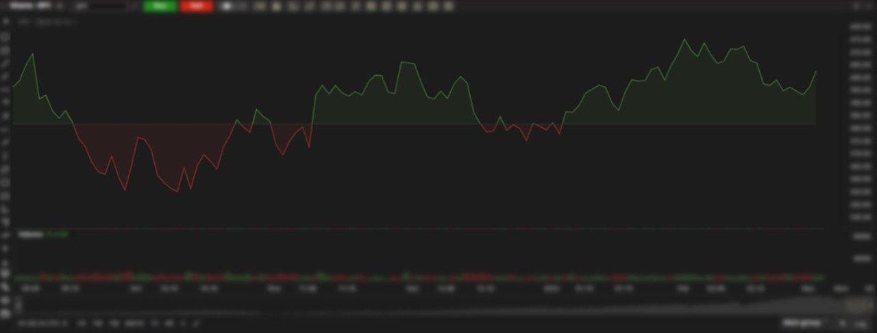
The colour of the shaded area is based on the Close vs the current baseline (can be adjusted at anytime) and can be used for analyzing price fluctuations.
Customize colours – Click the Settings icon in the upper menu bar, then Colours in the left column.

Algorithm
Up - Close price > Baseline price (green by default)
Down - Close price < Baseline price (red by default)
TREND. Shows Open, High, Low and Close.
The Trend chart is like the Hollow Candles chart except it adds more colouring logic to identify when there are trends moving up, down or sideways in the closing prices of each bar. This is more apparent when viewing shorter timeframes.

Candles are hollowed based on same period (current Close vs. current Open).
Candles are coloured based on previous period (current Close vs. previous Close).
Here is the same chart using Hollow Candles (below). Notice there are more white candles using a Trend chart (above), making it easier to visualize when the price trend has remained neutral.

Customize colours – Click the Settings icon in the upper menu bar, then Colours in the left column.

Algorithm
Bullish Candle (Hollow) - Current Close > Current Open
Bearish Candle (Filled) - Current Close < Current Open
Colour
Bullish Body - Current Close > Previous Close (green by default)
Bull Border - Current Close > Previous Close (green by default)
Bearish Body - Current Close < Previous Close (red by default)
Bearish Border - Current Close < Previous Close (red by default)
Doji - Current Close = Previous Close (white by default)
DRAWINGS. The following section describes the different drawing tools available to help you analyze price action.
Basic
Fibonacci
Regression
Advanced
Basic
TREND LINE. Illustrate trends in price action in the form of support/resistance.
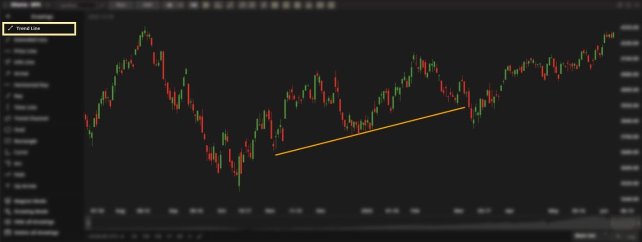
For illustrative purposes only.
Draw a trend line:
Left-click on the initial point on your chart to start your drawing.
Left-click on the second point to lock your trend line in place.
Edit a trend line:
Double click on the drawing to open the Settings menu.
EXTENDED LINE. A trendline that extends indefinitely to the left and right, even as new bars are added to the chart over time.

For illustrative purposes only.
Draw an extended line:
Left-click on the initial point on your chart to start your drawing.
Left-click on the second point to lock your extended line in place.
Edit an extended line:
Double click on the drawing to open the Settings menu.
PRICE LINE. A horizontal line, useful when illustrating price levels on any timeframe since it extends in perpetuity from left to right.

For illustrative purposes only.
Draw a price line:
Left-click on any price level of your chart to lock your price line in place.
Edit a price line:
Double click on the drawing to open the Settings menu.
INFO LINE. A line that connects two points and displays information such as the number of bars through which it spans, time covered or price change in dollars to name a few.

For illustrative purposes only.
Based on the start to end of your Trend Line, the Info Line shows:
$ price change
% price change
Number of bars
Time measured
Distance in pixels
Angle of the Trend Line
Draw an info line:
Left-click on the initial point on your chart to start your drawing.
Left-click on the second point to lock your info line in place.
Edit an info line:
Double click on the drawing to open the Settings menu.
ARROW. Illustrate direction with this tool.

For illustrative purposes only.
Draw an arrow:
Left-click on the initial point on your chart to start your drawing.
Left-click on the second point to lock your arrow in place.
Edit an arrow:
Double click on the drawing to open the Settings menu.
HORIZONTAL RAY. A horizontal price line that extends indefinitely to the right, even as new bars are added to the chart over time.

For illustrative purposes only.
Draw a horizontal ray:
Left-click on any price level of your chart to lock your horizontal ray in place.
Edit a horizontal ray:
Double click on the drawing to open the Settings menu.
RAY. A trend line that extends indefinitely to the right, even as new bars are added to the chart over time.

For illustrative purposes only.
Draw a horizontal ray:
Left-click on any price level of your chart to lock your horizontal ray in place.
Edit a horizontal ray:
Double click on the drawing to open the Settings menu.
TIME LINE. A vertical line used to mark certain points in time on a chart.

For illustrative purposes only.
Draw a time line:
Left-click on any point in time on your chart to lock your time line in place.
Edit a time line:
Double click on the drawing to open the Settings menu.
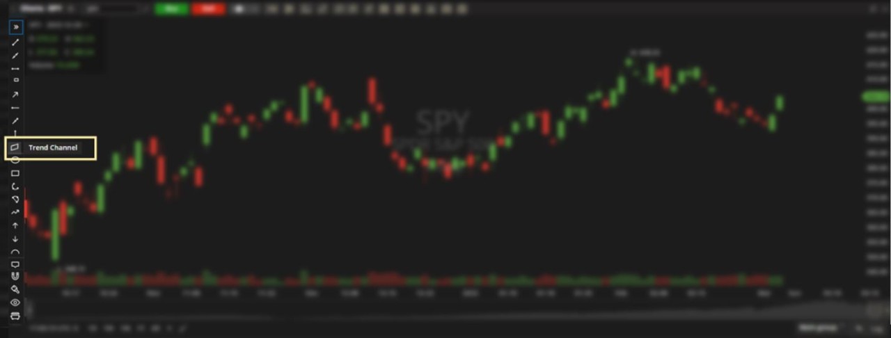
TREND CHANNEL. Two trendlines drawn at the same angle. Useful when identifying both the support and the resistance levels of a trend.

For illustrative purposes only.
Draw a trend channel:
Left-click on the initial point on your chart to start your drawing.
Left-click on the second point to lock your first trend line in place.
Drag the cursor vertically and left-click to lock the channel in place.
Edit a trend channel:
Double click on the drawing to open the Settings menu.
OVAL. A circular drawing tool useful for highlighting any particular area of a chart.

For illustrative purposes only.
Draw an oval:
Left-click on the initial point on your chart to start your drawing.
Left-click on the second point to lock the width of your oval in place.
Drag the cursor vertically and left-click to lock the drawing in place.
Edit an oval:
Double click on the drawing to open the Settings menu.
RECTANGLE. A box-shaped drawing tool useful for highlighting any particular area of a chart.

For illustrative purposes only.
Draw a rectangle:
Left-click on the initial point on your chart to start your drawing.
Left-click on the second point to lock the rectangle in place.
Edit a rectangle:
Double click on the drawing to open the Settings menu.
CURVE. Helps project a widening range over time, similar to what you will see when studying Probability Analysis.

For illustrative purposes only.
Draw a curve:
Left-click on the initial point on your chart to start your drawing.
Left-click on the second point to lock the opposite side of your curve in place.
Move the cursor and left-click to lock the drawing in place.
Edit a curve:
Double click on the drawing to open the Settings menu.
ARC. A circular drawing tool useful for highlighting any particular area of a chart.

For illustrative purposes only.
Draw an arc:
Left-click on the initial point on your chart to start your drawing.
Left-click on the second point to lock the opposite side of your arc in place.
Move the cursor and left-click to lock the drawing in place.
Edit an arc:
Double click on the drawing to open the Settings menu.
PATH. Draw a path with multiple pivot points to illustrate direction.

For illustrative purposes only.
Draw a path:
Left-click on the initial point on your chart to start your drawing.
Left-click on the second point to lock the pivot point in place. Repeat as needed.
Double click to complete your drawing.
Edit a path:
Double click on the drawing to open the Settings menu.
UP ARROW. A vertical Arrow drawing tool used to point out specific bars or other elements of the chart.

For illustrative purposes only.
Draw an up arrow:
Drag your cursor until the arrow is in place.
Double click to complete your drawing.
Edit an up arrow:
Double click on the drawing to open the Settings menu.
DOWN ARROW. A vertical Arrow drawing tool used to point out specific bars or other elements of the chart.

For illustrative purposes only.
Draw a down arrow:
Drag your cursor until the arrow is in place.
Double click to complete your drawing.
Edit a down arrow:
Double click on the drawing to open the Settings menu.
PRICE LABEL. Mark the price of any point on a chart.

For illustrative purposes only.
Draw a price label:
Drag your cursor to the point on your chart you want to label.
Left-click to lock the price label in place.
Edit a price label:
Double click on the drawing to open the Settings menu.
CALLOUT. Create a short string of text and link it to a particular element on the chart.

For illustrative purposes only.
Draw a callout:
Left-click on the point on your chart you want to callout.
Left-click on the area you want the text to appear.
Double click on the text box and type in your content.
Click outside the text box to complete your drawing.
Edit a callout:
Double click on the drawing to open the Settings menu.
ICON. Browse a library of icons to mark specific areas of your chart with.

For illustrative purposes only.
Draw an icon:
Select an icon from the menu.
Left-click on the area of the chart you want the icon to appear on.
Edit an icon:
Hover over an icon and drag the two circles to resize it.
Double click on the drawing to open the Settings menu.
TEXT. A popular labelling tool, useful for annotations or titles.

For illustrative purposes only.
Draw a text box:
Left-click on the area you want the text to appear.
Double click on the text box and type in your content.
Click outside the text box to complete your drawing.
Edit a text box:
Double click on the drawing to open the Settings menu.
BRUSH. A freehand drawing tool to mark important elements on a chart.

For illustrative purposes only.
Draw using the brush tool:
Hold the left mouse button on the initial point on your chart to start your drawing.
Release the left mouse button to complete your drawing.
Edit a drawing:
Double click on the drawing to open the Settings menu.
HIGHLIGHTER. A freehand drawing tool to highlight important elements on a chart.

For illustrative purposes only.
Use the highlighter tool:
Hold the left mouse button on the initial point on your chart to start your drawing.
Release the left mouse button to complete your drawing.
Edit a highlighted area:
Double click on the drawing to open the Settings menu.
PRICE RANGE. Measure price intervals (vertical movements) on a chart.

For illustrative purposes only.
Draw a price range:
Left-click on the initial point on your chart to start your drawing.
Drag the cursor diagonally and left-click to lock the drawing in place.
Edit a price range:
Double click on the drawing to open the Settings menu.
DATE RANGE. Measure number of bars and time intervals (horizontal movements) on a chart.

For illustrative purposes only.
Draw a date range:
Left-click on the initial point on your chart to start your drawing.
Drag the cursor diagonally and left-click to lock the drawing in place.
Edit a date range:
Double click on the drawing to open the Settings menu.
DATE AND PRICE RANGE. Measure both the number of bars/time intervals passed and the price range of a given section of your chart.

For illustrative purposes only.
Draw a date and price range:
Left-click on the initial point on your chart to start your drawing.
Drag the cursor diagonally and left-click to lock the drawing in place.
Edit a date and price range:
Double click on the drawing to open the Settings menu.
Fibonacci
FIBONACCI RAYS. A series of trendlines drawn from the same start point, based on the Fibonacci sequence.

For illustrative purposes only.
Draw Fibonacci Rays:
Left-click on the initial point on your chart to start your drawing.
Left-click on the second point to lock the Fibonacci Rays in place.
Edit Fibonacci Rays:
Double click on the drawing to open the Settings menu.
TIP: You can choose the number of rays and the value of the ratios being used.
FIBONACCI ARCS. A series of arcs measured from the same start point, based on the Fibonacci sequence.
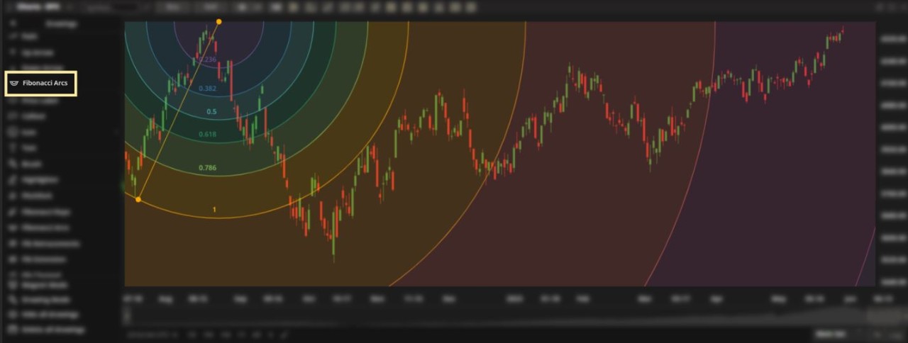
For illustrative purposes only.
Draw Fibonacci Arcs:
Left-click on the initial point on your chart to start your drawing.
Left-click on the second point to lock the Fibonacci Arcs in place.
Edit Fibonacci Arcs:
Double click on the drawing to open the Settings menu.
TIP: You can choose the number of arcs and the value of the ratios being used.
FIBONACCI RETRACEMENTS. A series of price levels based on the Fibonacci sequence.
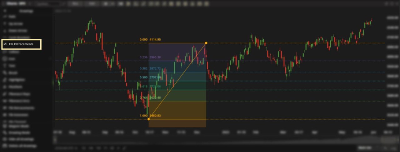
For illustrative purposes only.
Draw Fibonacci Retracements:
Left-click on the initial point on your chart to start your drawing.
Left-click on the second point to lock the Fibonacci Retracement levels in place.
Edit Fibonacci Retracements:
Double click on the drawing to open the Settings menu.
TIP: You can choose the number of retracement levels and the value of the ratios being used.
FIBONACCI EXTENSION. A series of price levels based on the Fibonacci sequence.

For illustrative purposes only.
Draw Fibonacci Extension levels:
Left-click on the initial point on your chart to start your drawing.
Left-click on the second point on your chart.
Drag your cursor along your chart to lock the Fibonacci Extension levels in place.
Edit Fibonacci Extension levels:
Double click on the drawing to open the Settings menu.
TIP: You can choose the number of extension levels and the value of the ratios being used.
FIBONACCI CHANNEL. A series of price channels based on the Fibonacci sequence.

For illustrative purposes only.
Draw Fibonacci Channels:
Left-click on the initial point on your chart to start your drawing.
Left-click on the second point to lock your first trend line in place.
Drag the cursor vertically and left-click to lock the channels in place.
Edit Fibonacci Channels:
Double click on the drawing to open the Settings menu.
TIP: You can choose the number of trendlines and the value of the ratios being used.
FIBONACCI TIMEZONE. A series of time intervals based on the Fibonacci sequence.

For illustrative purposes only.
Draw Fibonacci Timezones:
Left-click on the initial point on your chart to start your drawing.
Left-click on the second point to lock your Fibonacci Timezones in place.
Edit Fibonacci Timezones:
Double click on the drawing to open the Settings menu.
TIP: You can choose the number of timezones and the ratios being used.
FIBONACCI TIME EXTENSION. A series of time intervals based on the Fibonacci sequence.
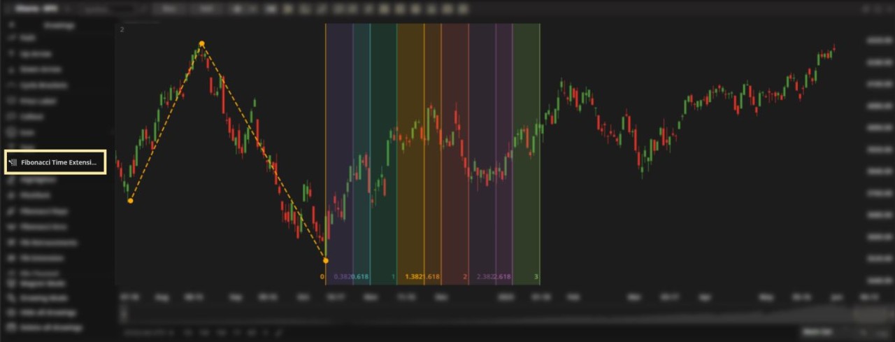
For illustrative purposes only.
Draw Fibonacci Time Extension lines:
Left-click on the initial point on your chart to start your drawing.
Left-click on the second point on your chart.
Drag the cursor and left-click to lock the time extension lines in place.
Edit Fibonacci Time Extension lines:
Double click on the drawing to open the Settings menu.
TIP: You can choose the number of time lines and the value of the ratios being used.
FIBONACCI TIME RATIOS. A series of time intervals used based on the Fibonacci sequence.

For illustrative purposes only.
It's similar to the Fibonacci Timezones with the difference that Fibonacci Time Ratios show labels according to the Fibonacci sequence.
The differences are illustrated below.

Fibonacci Time Ratios. For illustrative purposes only.
.

Fibonacci Timezone. For illustrative purposes only.
Draw Fibonacci Time Ratios:
Left-click on the initial point on your chart to start your drawing.
Left-click on the second point to lock your Fibonacci Time Ratios in place.
Edit Fibonacci Time Ratios:
Double click on the drawing to open the Settings menu.
TIP: You can choose the number of intervals and the ratios being used. .
FIBONACCI SPIRAL. Based on the Golden Spiral concept, it's believed that the coils intersect significant points on the chart.

For illustrative purposes only.
Draw a Fibonacci Spiral:
Left-click on the initial point on your chart to start your drawing.
Left-click on the second point to lock your Fibonacci Spiral in place.
Edit a Fibonacci Spiral:
Double click on the drawing to open the Settings menu.
TIP: You can change adjust the spiral length or reverse direction (counterclockwise).
Regression
REGRESSION TREND. A trend-following tool based on the statistical concept of regression.

For illustrative purposes only.
Draw a regression trend:
Left-click on the initial point on your chart to start your drawing.
Left-click on the second point to lock your regression trend in place.
Edit a regression trend:
Double click on the drawing to open the Settings menu.
TIP: Use the Settings icon to adjust the number of standard deviations used.
Advanced
CYCLE BRACKETS. A series of arcs of equal length drawn across the time axis.
Used to mark significant areas on a chart to guage how close to the beginning, peak or end of a cycle the current price action is.

For illustrative purposes only.
Draw cycle brackets:
Left-click on the initial point on your chart to start your drawing.
Left-click on the second point to lock your cycle brackets in place.
Edit cycle brackets:
Double click on the drawing to open the Settings menu.
PITCHFORK. A series of price channels that are separated by standard deviations.

For illustrative purposes only.
Draw a pitchfork:
Left-click on the initial point on your chart to start your drawing.
Left-click on the second point to start drawing the channel.
Drag the cursor vertically and left-click to lock the channel in place.
Edit a pitchfork:
Double click on the drawing to open the Settings menu.
TIP: Use the Settings icon to adjust the number of standard deviations/channels used.
GANN SQUARE. A squared area on the chart that consists of levels, fans and arcs.
The main idea is to identify a proper squared relationship.

For illustrative purposes only.
Draw a Gann Square:
Left-click on the initial point on your chart to start your drawing.
Left-click on the second point to lock your Gann Square in place.
Edit a Gann Square:
Double click on the drawing to open the Settings menu.
TIP: Use the Settings icon to adjust the number of levels, fans and arcs used.
GANN BOX. A tool that plots a grid of squares formed by price and time levels.
Gann Box is drawn by two points in order to make up a square.

For illustrative purposes only.
Draw a Gann Box:
Left-click on the initial point on your chart to start your drawing.
Left-click on the second point to lock your Gann Box in place.
Edit a Gann Box:
Double click on the drawing to open the Settings menu.
TIP: Use the Settings icon to adjust the price and time levels used.
GANN FAN. A series of indefinite rays drawn from the same start point.
The rays divide time and price on the chart into proportional parts according to Gann method (ratios that are indicated at the end of each line).
For example, if it takes one unit of time to pass for price to rise by one unit, the ratio is 1:1 and the trend line is drawn at a 45-degree angle.
A ratio of 2:1 will see a slope drawn at less than 45 degrees that is not as steep.

For illustrative purposes only.
Draw a Gann Fan:
Left-click on the initial point on your chart to start your drawing.
Left-click on the second point to lock your Gann Fan in place.
Edit a Gann Fan:
Double click on the drawing to open the Settings menu.
TIP: Use the Settings icon to adjust the number of rays/ratios used.
ELLIOTT IMPULSE (1-2-3-4-5). A subjective labelling tool based on the Elliott Wave Theory, which believes price moves up and down in waves.
The Impulse Wave travels in the same direction of the larger trend and when examined closely, is made up of five smaller waves (referred to as '1-2-3-4-5' waves).
The Correction Wave that follows is shorter and temporarily retraces the move. When examined closely, this is made up of three smaller waves (referred to as 'A-B-C' waves).

For illustrative purposes only.
Draw an Elliott Impulse Wave:
Left-click on the initial point on your chart to start your drawing.
Left-click on the second point to lock the first wave in place.
Repeat until all five waves have been placed.
Edit an Elliott Impulse Wave:
Double click on the drawing to open the Settings menu.
ELLIOTT CORRECTION (A-B-C). A subjective labelling tool based on the Elliott Wave Theory, which believes price moves up and down in waves.
The Impulse Wave travels in the same direction of the larger trend and when examined closely, is made up of five smaller waves (referred to as '1-2-3-4-5' waves).
The Correction Wave that follows is shorter and temporarily retraces the move. When examined closely, this is made up of three smaller waves (referred to as 'A-B-C' waves).

Draw an Elliott Correction Wave:
Left-click on the initial point on your chart to start your drawing.
Left-click on the second point to lock the first wave in place.
Repeat until all three waves have been placed.
Edit an Elliott Correction Wave:
Double click on the drawing to open the Settings menu.
STUDIES. Technical indicators to help identify market trends and mark trade signals.
Add a study – Click the Studies icon and the Edit Studies box will appear.
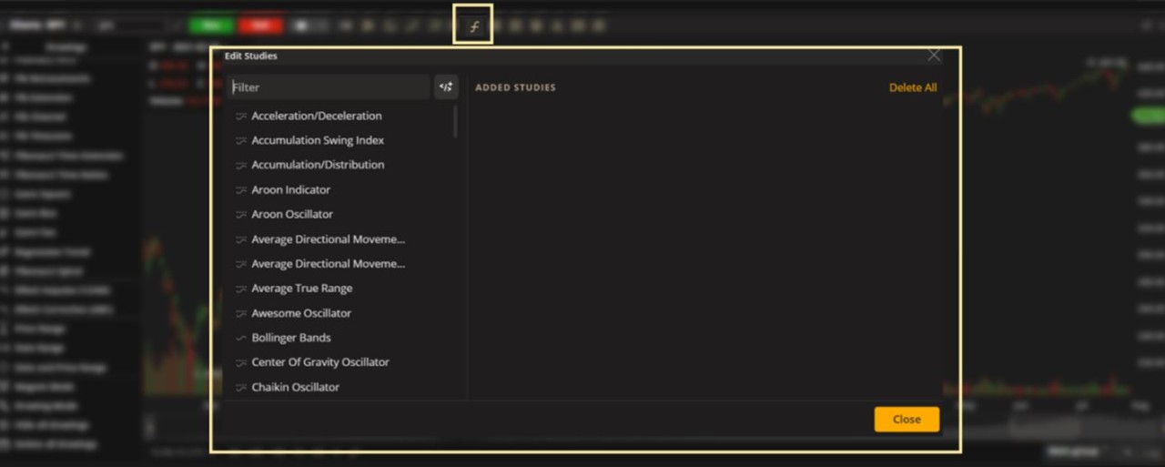
Next, type in the name of a study or scroll down the list below.
Then double click a study on the list or drag it to the right.
Delete a study – Click on any study in the Added Studies section.
Click the X icon to the right of the study.
Edit a study – Click on any study in the Added Studies section.
Customize the parameters or click Restore to Default to revert to the original settings.
TIP: Find a full description of a study by hovering over it and clicking the Help icon.
WATCHLIST. View market activity in a simplified dashboard.
Traders who build and actively manage an effective watchlist generally simplify their trading and are better equipped to spot market opportunities as they arise.
Use prebuilt lists or define your own set to help find your next trade ideas.
Choose a watchlist – Click the name of the current watchlist in the upper-left area and select from the menu given.

Create, duplicate or import a watchlist – Click the name of the current watchlist in the upper-left area and select from the menu given.

When creating a new list, type in the name and click Save.

Edit your personal watchlist – View the list and add or delete symbols any time.

Rename or delete a personal watchlist - Click the name of the current watchlist and use the Pencil icon (rename) or X icon (delete) to the right.

Trade from a watchlist – (1) Right-click on a symbol and use the action menu or (2) click on the Bid/Ask columns.
(1) Right-click:

(2) Click on the Bid/Ask column:

Customize columns – Click the Menu icon.
Next, click Columns Customization.

Choose from the following metrics:
% Change
52 week High
52 week Low
Ask
Ask Size
Beta
Bid
Bid Size
CUSIP
Change
Days To Expiration
Delta **
Description
Expiration Date
First Notice Date
Gamma
High
Impl Vol **
Initial Margin
Instrument
Last
Last Size
Last Trade Date
Limit Down
Limit Up
Low
Maintenance Margin
Mark
Market Cap.
Open
Open Int
Prev Close
Quote Trend
Rho
Shares
Spread
Strike
Theo Price
Theta
Tick Value
Trading Halt
Vega
Volume
**Note: The method of deriving the implied volatility and Delta for Equity, ETFs and Index options employs the market standard approaches, namely Black-Scholes model for European options and Bjerksund-Stensland model for American options.
It has its own proprietary approach to derive the model inputs based on the market's risk-free rates, dividends and observable option prices.

OPTION CHAIN. Build up to 4-legged strategies. Analyze option statistics.
In addition to the option chain itself, this widget gives information on today's option trades to help you understand the current market. Find stats on volatility, a breakdown of all calls and puts traded and a time & sales section to help filter today's largest trades.
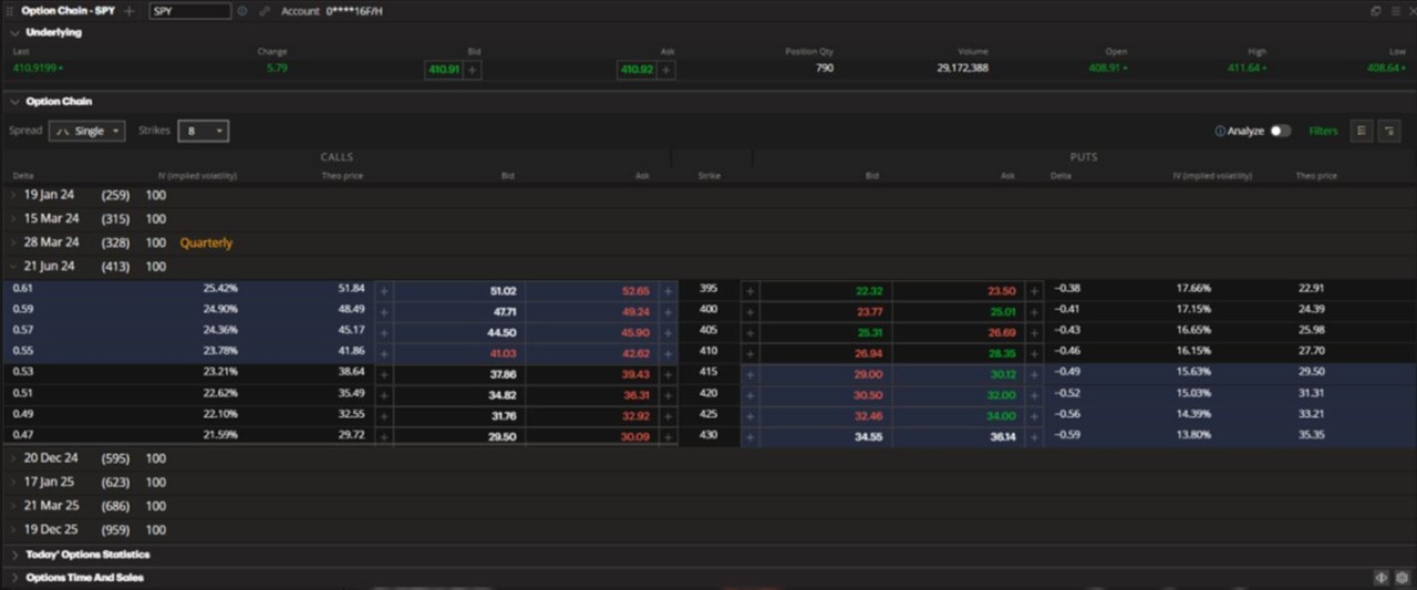
This widget is divided into the four sections – Underlying, Option Chain, Today's Option Statistics and Option Time and Sales.
UNDERLYING. Get quotes on the underlying symbol.

Create an equity order – Click on the Bid or Ask.

NOTE: The status of the price box is unlocked and will fluctuate to match the current Bid/Ask in real time.
Click icon until it is in a locked position to prevent the price from fluctuating.
Customize columns in Underlying section – Click the Menu icon.
Next, click Underlying Metrics.

Choose from the following metrics:
% Change
Ask
Avg Fill price
Bid
Change
Day Open P/L
Day P/L, acc
Days To Expiration
Description
Expiration Date
First Notice Date
High
Initial Margin
Last
Last Trade Date
Low
Limit Down
Limit Up
Maintenance Margin
Mark
Open
Open P/L, acc
Position Qty
Prev Close
Spread
Tick Value
Trading Halt
Volume

OPTION CHAIN. Get quotes and build multi-leg strategies.

Spread - Choose the type of spread displayed.

TIP: The graphics in the left column are the general risk profiles of each spread type.
Deep and Wide
For certain spreads, select the width of the strikes and the number of expiration dates between contracts.
Strike width – Click the +/- buttons or type in the number directly.

Expiration dates – Click the +/- buttons or type in the number directly.

Strikes – Click to select the number of strikes displayed per expiration date.

Create an order from the Option Chain – Click on the Bid or Ask of a quoted contract or spread.

NOTE: The status of the price box is unlocked and will fluctuate to match the current Bid/Ask in real time.
Click icon until it is in a locked position to prevent the price from fluctuating.
Build a custom multi-leg order - Click on the Bid or Ask of a contract you want to include.
1st leg will be added to the Order Entry section.

2nd leg – (a) Click the + button next to the Bid or Ask or (b) Hold CTRL on your keyboard and click the Bid or Ask of the next contract you want to include. It will be added to the Order Entry section.

3rd and 4th legs (max number allowed) – Repeat as needed until your order is complete.

Filters
Click Filters on the right side of the widget and choose to display the following:
Option Type – Calls & Puts, Calls only or Puts only.
Expiration Type – Regular (standard), Quarterly, Monthly or Weekly.
Expiration – All Series, Next or Date Range (manually selected).
Show Front Month – If off, expirations with less than 14 days to expiry will not be shown.
Show Non-standard Options – If off, options with non-standard deliverables will not be shown.

Customize columns in Option Chain – Click the Menu icon.
Next, click Option Chain.

Choose from the following metrics:
% Change
Annualized RoR (only available for Single leg spreads)
Ask size
Bid size
Change
Delta **
Extrinsic
Gamma
High
Impl Vol **
Intrinsic
Last
Low
Mid
Open Int
Prob. ITM (only available for Single leg spreads)
Prob. OTM (only available for Single leg spreads)
Prob. Touch (only available for Single leg spreads)
Rho
Theo price
Theta
Vega
Volume
**Note: The method of deriving the implied volatility and Delta for Equity, ETFs and Index options employs the market standard approaches, namely Black-Scholes model for European options and Bjerksund-Stensland model for American options.
It has its own proprietary approach to derive the model inputs based on the market's risk-free rates, dividends and observable option prices.
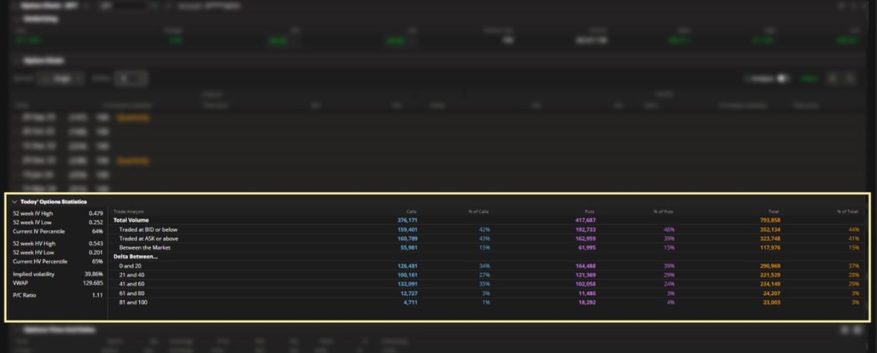
TODAY'S OPTION STATISTICS. Analyze today's market with a breakdown of its trade statistics.

OPTION TIME AND SALES. Take a look at today's trades and filter the largest Call and Put transactions for additional market insight.

Today's Biggest – Click the Settings icon and select the number of trades to display (an equal number of Call and Put trades will appear).

Customize columns in Time and Sales – Click the Menu icon.
Next, click Options Time and Sales.

Choose from the following metrics:
Time and Date
Option
Qty
Exchange
Price
Bid
Ask
Delta
Impl Vol
Underlying

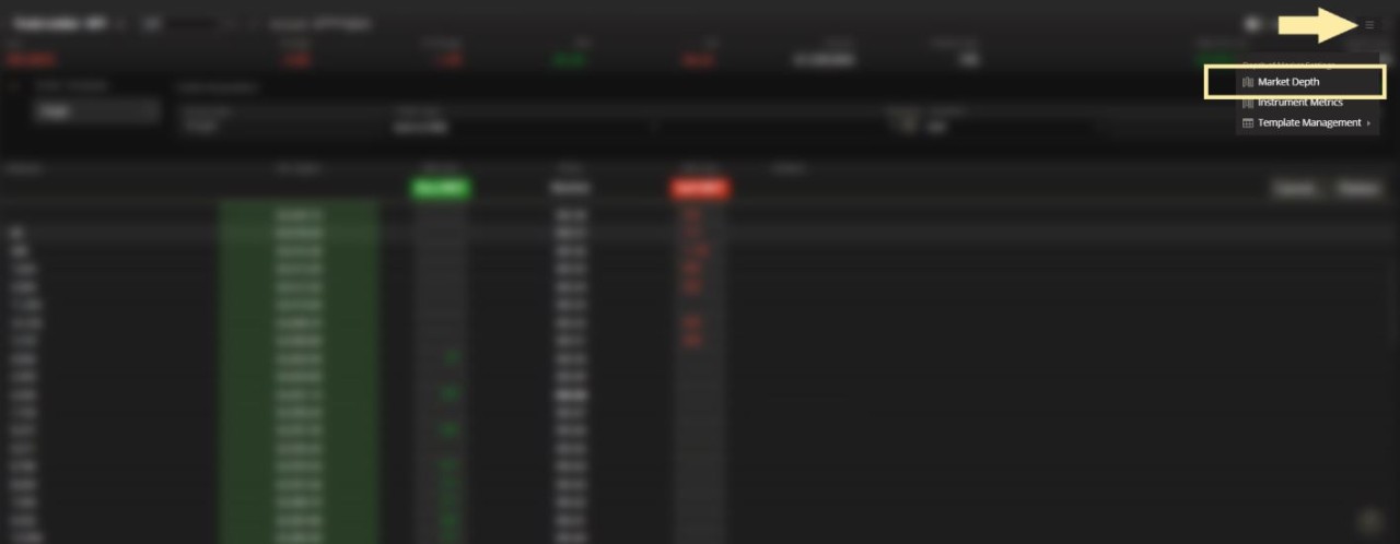
MARKET DEPTH. View the overall liquidity of a stock.
If market behaviour is a reflection of supply and demand, Market Depth is a tool that traders use to study exactly that. Here you can see the order book of a security, which is a list of all pending orders to buy or sell at different price levels, updated in real-time.
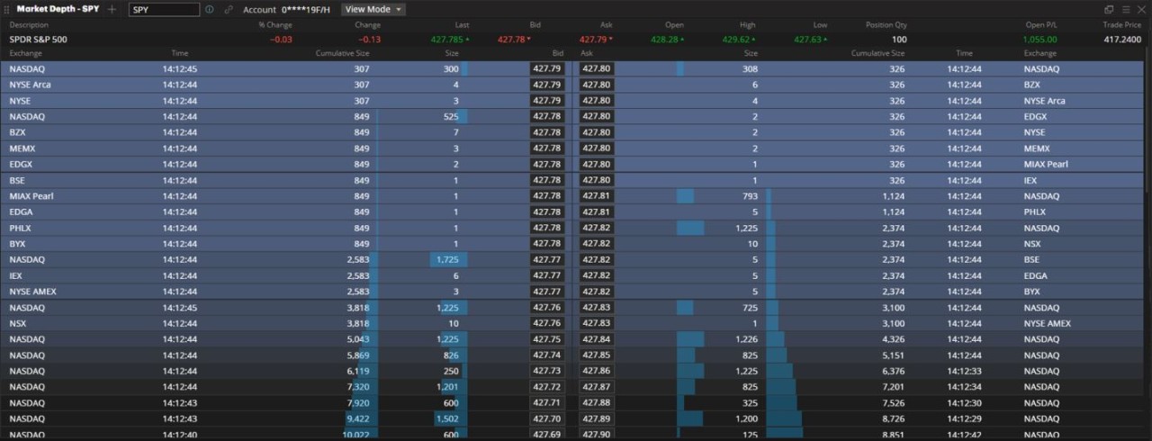
This widget is divided into the two sections - Instrument Metrics and Market Depth.
INSTRUMENT METRICS. Find market information on the underlying symbol.

Create an order – Click on the Bid/Ask on the Instrument Metrics area – direction and price of the order will match your selection.

NOTE: The status of the price box is unlocked and will fluctuate to match the current Bid/Ask in real time.
Click icon until it is in a locked position to prevent the price from fluctuating.
Customize columns in Instrument Metrics – Click the Menu icon.
Next, click Instrument Metrics.

Choose from the following Instrument Metrics:
% Change
Ask
Avg Fill Price
Bid
Change
Day Open P/L
Day P/L, acc
Days to Expiration
Description
Expiration Date
First Notice Date
High
Initial Margin
Last
Last Trade Date
Limit Down
Limit Up
Low
Maintenance Margin
Mark
Open
Open Int
Open P/L, acc
Prev Close
Position Qty
Spread
Tick Value
Trading Halt
Volume

MARKET DEPTH. View the order book for the underlying symbol.

Choose view mode - Click to view the book by price or by order.

Market by price – All orders at the same price and at the same market are combined.
NASDAQ Market by order – All orders at the same price at this market are displayed individually.
BATS/EDGE Market by order - All orders at the same price at these markets are displayed individually.
Create an order – Click a Bid/Ask on the Market Depth area – direction and price of the order will match your selection.
NOTE: Price does not fluctuate and remains at the selected price. Lock icon is already set to the locked position.

Show Limit Price in Market Depth – Click the Menu icon.
Next, click Show Limit Price.

Show Orders in Market Depth – Click the Menu icon.
Next, click Show Orders.

Customize columns in Market Depth – Click the Menu icon.
Next, click Market Depth Columns.

Choose from the following metrics:
Exchange
Time
Cumulative Size
Size

TRADE LADDER. Build orders quickly and send them to market just as fast.
This widget is built around a price ladder that shows the best Bid/Ask and Last Traded price in realtime. It lets traders prepare highly-customized orders (see Order Template below), ready to send with a single click (using the Auto-Send option) at any price displayed.
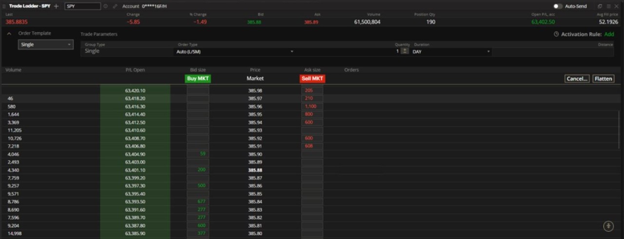
This tool is broken down into three sections – Instrument/Position information, Order Template and the Trade Ladder itself.
INSTRUMENT/POSITION INFO. Get quotes on the underlying instrument and your current position in real time.

Create an order – Click the Bid or Ask to create an equity order.

NOTE: The status of the price box is unlocked and will fluctuate to match the current Bid/Ask in real time.
Click icon until it is in a locked position to prevent the price from fluctuating.
Customize columns in Instrument Metrics – Click the Menu icon.
Next, click Instrument Metrics.

Choose from the following metrics:
% Change
Ask
Avg Fill price
Bid
Change
Day Open P/L
Day P/L, acc
Days To Expiration
Description
Expiration Date
First Notice Date
High
Initial Margin
Last
Last Trade Date
Limit Down
Limit Up
Low
Maintenance Margin
Mark
Open
Open Int
Open P/L, acc
Position Qty
Prev Close
Spread
Tick Value
Trading Halt
Volume

ORDER TEMPLATE. Build the order that you will send to market through the Trade Ladder.

All order templates will require an Order Type, Quantity and Duration.
Order type – Choose from the following:
Auto (L/SM) – Adjusts your order type to the side of your trade (Limit for Buy orders or Stop Limit for Sell orders).
Limit – All Buy and Sell orders sent using a Limit price.
Stop Market – All Buy and Sell orders sent to market using a Stop Market price.

Quantity - Use the +/- icons or type in your quantity directly.

Duration – Click DAY or GTD (Good Til Date).
For GTD orders, click the Calendar icon and select the order's expiration date.

Distance – Choose how far apart in price a child order is from the parent order (applies to multi-leg orders).

For illustrative purposes – in the above example, entering a Buy order @ $300 will submit second (child) order @ $301 (parent $300 plus distance $1.00).
Auto-Send – Click to disable pre-trade messages. You will be prompted to read and accept a disclosure presented to you.

Add activation rule – Click Add in the upper-right area to add an activation rules to the order.

GROUP TYPE. Click the first dropbox to make your selection.

SINGLE ORDERS. Create a single-leg order.
Submit order - Hover over the Bid or Ask of the price you want to enter the trade at.
The group type will be displayed in Order column to the right.

OCO PAIR. Create a One Cancels Other (OCO) order.
Two orders are sent to market. If one order is filled, the other is cancelled.
Submit order - Hover over the Bid or Ask of the price you want to enter the trade at.
The group type will be displayed in Order column to the right.

FTO + OCO PAIR. Create a First Triggers OCO (FTO).
FTO + 1 OCO
After the initial order is filled, an OCO pair is sent to market.
Submit order - Hover over the Bid or Ask of the price you want to enter the trade at.
The group type will be displayed in Order column to the right.

For illustrative purposes – in the above example, when the parent (buy) order is filled, the OCO pair (two sell orders) will be sent to market.
FTO + 2 OCO
After your initial order is filled, two OCO pairs are sent to market.
This is useful when exiting your initial order in two separate stages.
Submit order - Hover over the Bid or Ask of the price you want to enter the trade at.
The group type will be displayed in Order column to the right.

For illustrative purposes – in the above example, when the parent (buy) order is filled, the two OCO pairs (four sell orders) will be sent to market.
TRADE LADDER.
Create order using the trade ladder - Click on the price and side you want to enter your order at.

For illustrative purposes – in the above example, clicking on the Buy column @ 390.72 will send the order created in the Order Template "Buy 100 shares @ Auto (L/SM), DAY order" @ $390.72 Limit.
Cancel orders – Click Cancel in the right area and choose to cancel the following order types:
Cancel All
Cancel All Buy
Cancel All Sell

Flatten open positions – Click Flatten in the right area to close any open positions in the underlying symbol.


Recenter – Click the Recenter icon to position the Last Traded Price in the middle of the Trade Ladder.

Customize columns in Market Depth – Click the Menu icon.
Next, click Market Depth.
Choose from the following metrics:
Volume
P/L Open
Bid size
Price
Ask size
Orders

TIME AND SALES. Take a closer look at recent trades.
This is the digital version of what was traditionally known as the 'stock ticker tape'. It is a running display of all trades executed for a stock and includes data points to help analyze market behaviour.
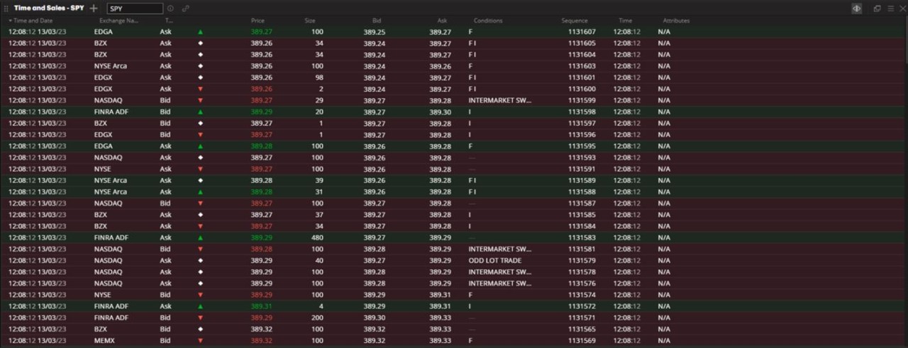
Each column tells information about the trade:
Time and Date – The time and date of the trade, based on the local timezone.
Exchange Name – The name of the exchange the trade was made on.
Type – Tells which quote was hit, the Bid or the Ask.
Price Direction – The direction of this trade versus the previous trade (up, down or no change).
Price – The price of the trade. It's coloured based on the change versus the previous trade (green for positive, red for negative and no colour for no change).
Size – The number of shares traded.
Bid – The Bid price at the moment of the trade. It's coloured based on the change versus the previous trade (green for positive, red for negative and no colour for no change).
Ask – The Ask price at the moment of the trade. It's coloured based on the change versus the previous trade (green for positive, red for negative and no colour for no change).
Conditions – Lists any trade conditions attached to this event.
Sequence – The trade sequence number (used to distinguish trades with the same timestamp).
Time – The time of the trade, based on the local timezone.
Attributes – Can (cancellation), Cor (correction), ETH (extended trading hours) or SPR (spread leg). These appear only when applicable to the trade.
Create an order – Click on the Bid/Ask column to initiate an order.

NOTE: The status of the price box is unlocked and will fluctuate to match the current Bid/Ask in real time.
Click icon until it is in a locked position to prevent the price from fluctuating.

Customize columns – Click the Menu icon.
Next, click Columns Customization.

Choose from the following metrics:
Time and Date
Exchange Name
Type
Price Direction
Price
Size
Bid
Ask
Conditions
Sequence
Time
Attributes

ALERTS. Be informed of events as they happen.
Monitoring market activity can consume a lot of time and take attention away from other elements of your trading day. Automate this task and stay aware of important events as they arise, which you may not have noticed otherwise.
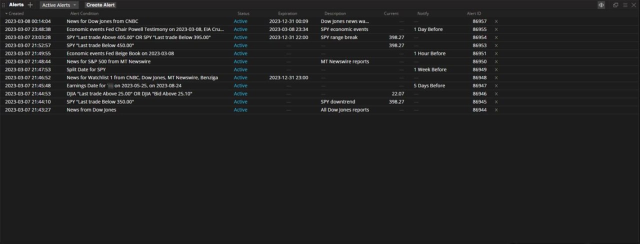
This widget lets you create and organize alerts.
CREATE ALERTS. Use the widget or the action menu.
Create alert using widget - Click Create Alert in the top left section.

Create alert using action menu - Right-click on a symbol anywhere in the platform and choose Create Alert.

Next, specify the alert details.

Market Alerts
Select Market.

Enter ticker symbol – Type in and select a symbol or index.

Select what to be alerted on – Click the dropbox and choose from the options given.

Select the comparison operator – Click the dropbox and choose from the options given.

Enter the numerical values – Type in the value directly or use the +/- buttons.

Add conditions – Click + Add Condition to build a list of conditions to be alerted on.
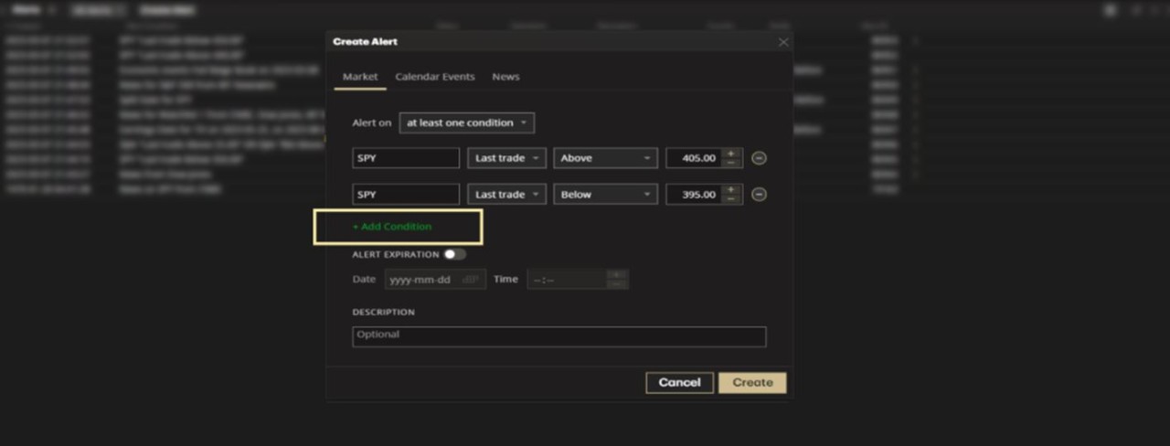
Remove conditions – Click the Minus icon next to the condition you want to remove.

Finalize your condition group - Choose to be alerted on at least one or all listed conditions.

Set expiration date (optional) – Enter the details directly or use the Calendar and +/- buttons.

Add custom description (optional) – Enter text directly in the text field.
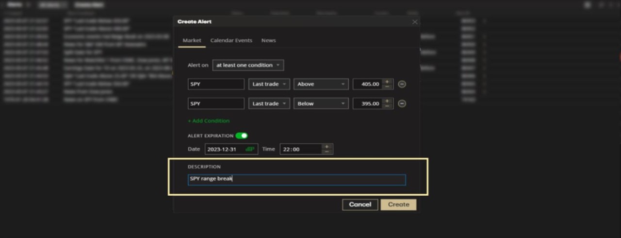
For illustrative purposes.
Submit alert - Click Create when done.
The Alert will appear on your Alerts widget.

Calendar Event Alerts
Select Calendar Events.

Select number of symbols to monitor – Choose one symbol or all symbols.

For One Symbol - Type in and select a symbol or index.

For All Symbols – 'Set of Events' is automatically selected with the matching event type.

For illustrative purposes - in the above example, 'Dividend' is the event selected.
Select the Calendar Event type – Click the dropbox and choose from:
Dividend
Split
Earning
Conference Call
Economic events

Select the event details - Click the dropbox and choose from:
Ex-Dividend Date
Payment Date

Select when to be notified – This applies to events with a set calendar date such as Dividends.

Set expiration date (optional) – Enter the details directly or use the Calendar and +/- buttons.

Choose an individual event or multiple events (when applicable) – Click Any New Event or Set of Events.
Set of Events – Scroll down the list and click on each event you want to include.

Add custom description (optional) – Enter text in the text field.

For illustrative purposes.
Submit alert - Click Create when done.
The Alert will appear on your Alerts widget.

News Alerts
Select News.

Select alert for – Click Symbol or Watchlist or All Symbols.
For Symbol or Watchlist – Enter and select a symbol or click the Watchlist tab to choose from any of your current watchlists.

Select news source – Click the dropbox and filter news source (optional).

Select number of alerts – Click Each New Item or The Next Item Only.
Each New Item – Alert remains in Active status until manually cancelled, delivering each new item.
The Next Item Only – Alert status changes to Triggered, delivering the next item only.

Set expiration date (optional) – Enter the details directly or use the Calendar and +/- buttons.

Add custom description (optional) – Enter text in the text field.

Submit alert - Click Create when done.
The Alert will appear on your Alerts widget.

ORGANIZE ALERTS.
Filter Active or All Alerts – Click the dropbox and select accordingly.

Cancel alerts – Right-click on the Alert or click the X icon next to the Alert.

Edit alerts – Right-click or double-click on the Alert.
Next, edit the details of your alert.

Customize columns – Click the Menu icon.
Next, click Columns Customization.

Available columns include:
Alert Condition
Alert ID
Created
Current
Description
Expiration
Notify
Status

RISK PROFILE. Estimate risk/reward probabilities.
Analyzing the risk/reward profile of a trade is crucial for every trader. This widget gives you a visual of the risk curve for a simulated trade or any of your current positions.
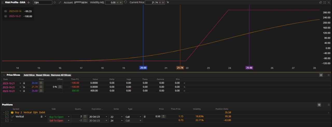
This section is divided into the Risk Profile graph, Price Slices list and the Positions list.
POSITIONS LIST. Select the position or planned trade that you want to analyze.
Analyze a current position – View the Positions list in the lower section of the widget and select/deselect the positions you want to analyze.
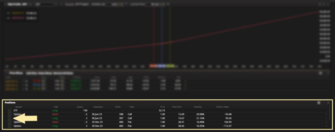
Trade a current position – Right-click on a position to bring up the action menu.

Add a simulated/planned trade to the Positions List – Build an order in the Order Entry tool and turn on the Analyze feature in the upper-right section.
Next, click Analyze in the lower right to submit the trade to the Risk Profile tool.

The order will appear in the Positions list and marked with a Planned Trade icon.

Convert a simulated/planned trade to a live trade – Right-click on the simulated/planned trade and use the action menu.
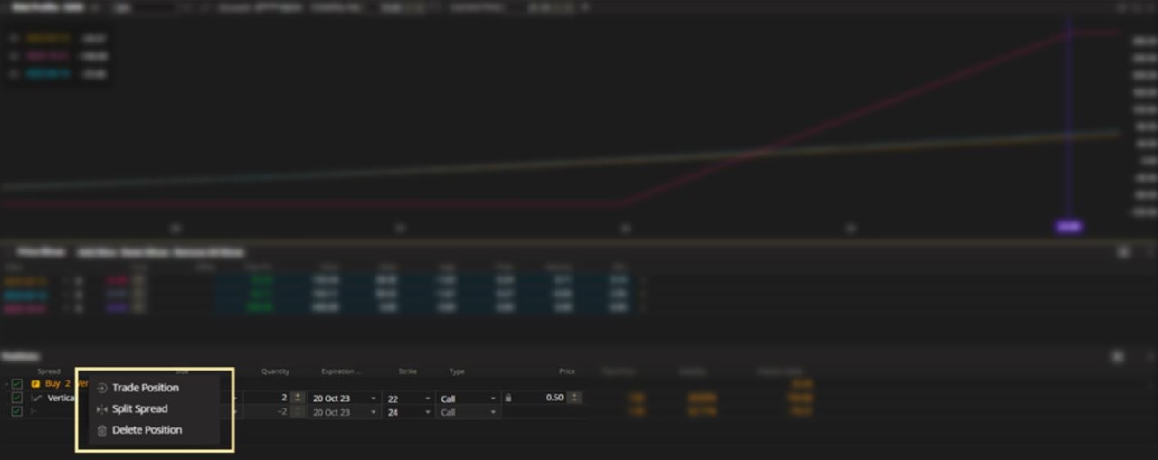
Customize columns in Positions List – Click the Menu icon.
Next, click Columns Customization.

Available metrics include:
General Fields
Days to Expiration
Instrument
Symbol
Theo Price
Underlying
Volatility **
Greeks
Delta **
Gamma
Position Delta
Position Gamma
Position Rho
Position Theta
Position Vega
Rho
Theta
Vega
**Note: The method of deriving the implied volatility and Delta for Equity, ETFs and Index options employs the market standard approaches, namely Black-Scholes model for European options and Bjerksund-Stensland model for American options.
It has its own proprietary approach to derive the model inputs based on the market's risk-free rates, dividends and observable option prices.

RISK PROFILE GRAPH. This section displays the risk profile of a current position or a simulated/planned trade.
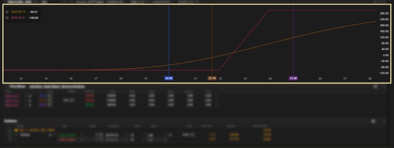
How to read this section:
X-Axis – This represents theoretical prices for the underlying symbol.

Y-Axis – This represents theoretical profit and loss in dollars.

P/L lines - You will see multiple theoretical profit and loss lines moving left to right, colour-coded by the dates in the upper-left section.

P/L at expiration – The dynamic line is the theoretical P/L profile of the position at expiration, which is based on intrinsic value.

For illustrative purposes – In this example, the trade's theoretical profit is $300 if the underlying equity closes at $24 or higher and theoretical loss is $100 if the underlying equity closes at $22 or lower at expiry.
P/L at today's date – The smoother line is the theoretical P/L profile of the position based on today's date, which is based on both intrinsic and extrinsic value.

Price slices – These are theoretical prices of the underlying equity, used to visually intersect with the theoretical P/L lines.

Manually plot price and P/L points – Hover your cursor over any point on the graph to view the intersection between price and theoretical P/L.

PRICE SLICES. This section lets you view the theoretical P/L lines in table form.

Price column – Enter any theoretical price for the underlying equity.
Next, the price will appear in the Risk Profile Graph, colour-coded by date.

For illustrative purposes – In the above example, all dates have been set to use $24 to illustrate the position's theoretical P/L at the different dates quoted.

For illustrative purposes – The Risk Profile Graph and the Price Slices section both show a theoretical profit of $300 if the underlying equity closes at $24 or higher at expiration.
Customize columns in Price Slices – Click the Menu icon.
Next, click Columns Customization.

Available metrics include:
Theo P/L
Value
Delta
Vega
Theta
Gamma
Rho
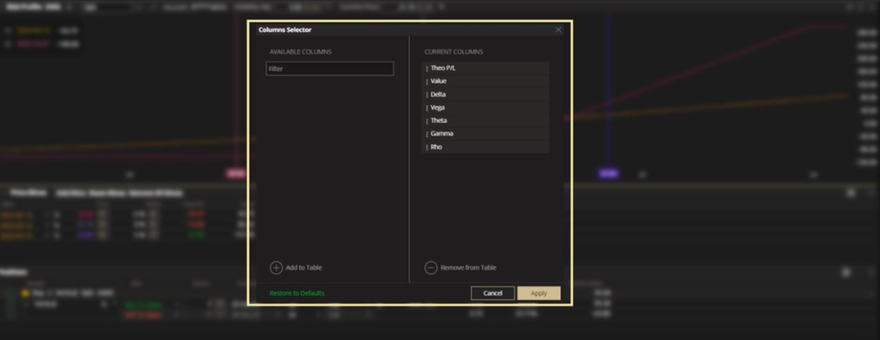
COMPANY FUNDAMENTALS. Take a look at a company from a fundamental point of view.
Look closer at business activites, analyst ratings and financial information over a given period of time.
This section is broken down into an Overview, Company Description and Statistics.
OVERVIEW. Find market information and analyst ratings.
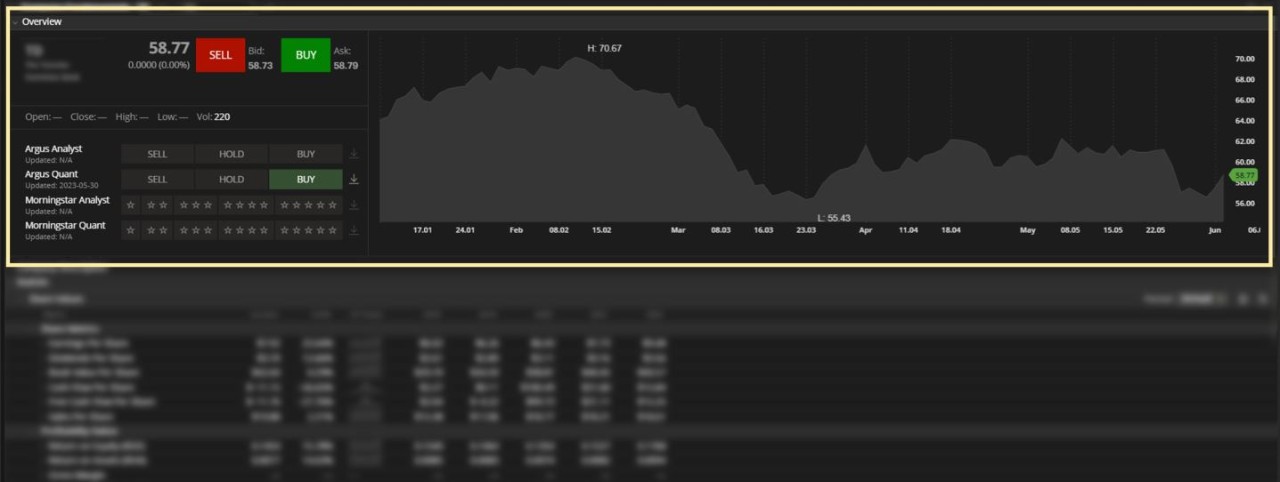
Create an order – Click Buy or Sell.

Analyst ratings – Find Sell/Hold/Buy recommendations (Argus Analyst and Argus Quant reports) and 1 to 5 star ratings (Morningstar Analyst and Morningstar Quant reports).

Download reports – Click the Download icon next to a report (when applicable).

Chart – Drag the Time axis or Price axis to adjust the price information in the chart area.

COMPANY DESCRIPTION. Find a brief description of the company's business activities and contact information.
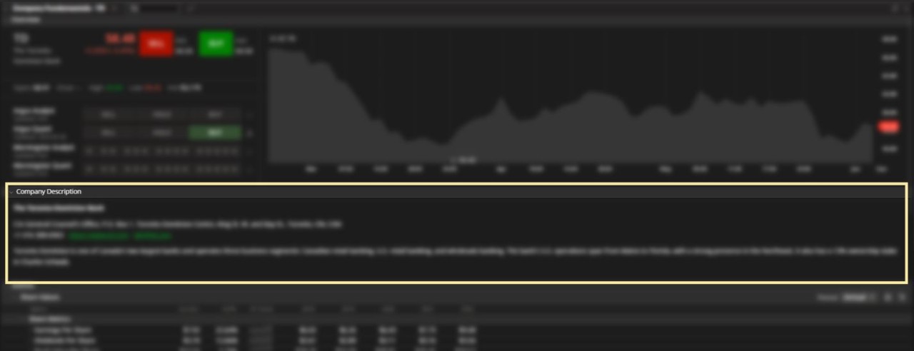
STATISTICS. View the following financial metrics.

Select period – Click the dropbox in the upper-right area to choose Annual or Quarterly information.

SHARE VALUES.
Share Metrics
Earnings Per Share
Dividends Per Share
Book Value Per Share
Cash Flow Per Share
Free Cash Flow Per Share
Sales Per Share

Profitability Ratios
Return On Equity (ROE)
Return On Assets (ROA)
Gross Margin
Operating Profit Margin
Net Profit Margin

Activity Ratios
Inventory Turnover
Assets Turnover

Financial Ratios
Long-term Debt to Capital
Financial Leverage
Payout Ratio
Quick Ratio
Current Ratio

GROWTH.
Valuation
Price/Earnings Ratio
Price/Cash Flow Ratio
Price/Book Value Ratio
Market Cap/Common Equity
Dividend Yield
Dividend Payout Ratio

Growth Rates
Revenue
Net Income
Earnings Per Share
Dividends Per Share
Book Value Per Share

SHARES OUTSTANDING AND MARKET CAP.
Number of Shares Outstanding
Market Capitalization

CUSTOMIZATION. There are no further sorting or customization abilities on this widget.
SCREENER. Find anything, anywhere!
Use the Screener to filter through tens of thousands of stocks and options so you can quickly find the conditions you look for when narrowing down your trade ideas.
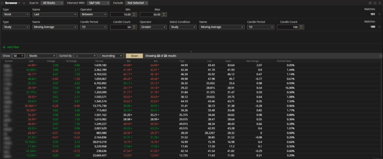
This widget is divided into two sections – Filters and Results.
FILTERS. Define your seach criteria.

Scan Stocks, Options or Both - Click the Scan In dropdown menu and select.

Choose which watchlists to scan in – Click Intersect With and select.

Choose what instruments to exclude – Click Exclude and select.
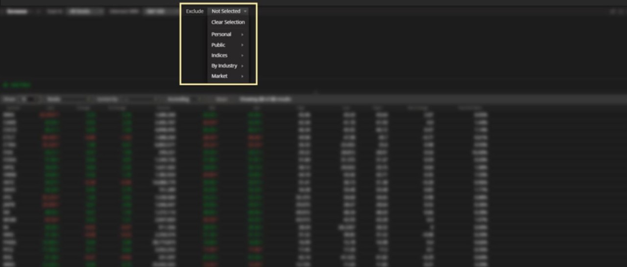
Add filter – Click Add Filter in the lower-left area.

Select type of filter – Click the dropdown menu and choose from:
Stock
Option
Fundamentals
Study

Next, each filter type will follow with its own set of criteria. Choose from the dropboxes as they appear to build you filter.
Remove a filter – Click the X icon at the far right.

RESULTS. View a list of matches.

Choose number of results to display – Click the first dropbox and enter a number manually or select from the list.

Choose what instruments to display – Click the second dropbox and choose Stocks, Options or both Stocks & Options.

Choose what filters to sort by– Click the third dropbox and choose from the list of filters created or display all (default).

Choose the order to display results in – Click the fourth dropbox and select.

Scan – Click Scan when you're ready to proceed.

Save results as a watchlist – Click the Menu icon.
Next, click Save as Watchlist.

Export list to CSV – Click the Menu icon.
Next, click Export to CSV.

Customize columns – Click the Menu icon.
Next, click Columns Customization.

Choose from the available metrics:

EARNINGS ANALYZER. Take a look at the relationship between Earnings Announcements and the pricing of securities and derivatives.
The Earnings Analyzer compares the 8 most recent Earnings Announcements to help visualize the changes in pricing, volatility and valuation data.
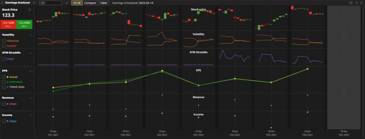
There are three ways to view data in this widget - Fit All (default view), Compare and Table.
FIT ALL VIEW. A consecutive view of the past two years of announcements.

Data Point Filters
Click the checkboxes to include any of the following in the earnings data columns:
Stock Price – Daily candles (Open, Low, High and Close) for the 5 consecutive trading days before and after the event.
Volatility – Historical and Implied Volatility for the 5 consecutive trading days before and after the event.
ATM Straddle – The price of the next expiry's ATM Option Straddle (as a percentage of the underlying stock price) for the 5 consecutive trading days before and after the event.
EPS – Actual versus Estimated Earnings Per Share.
Revenue – Reported Revenue.
Income – Reported Net Income.

Only the selected data points will appear to the right:
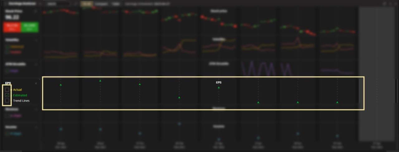
Create an order – Click the Buy or Sell button.

Use action menu – Click the Menu icon next to Stock Price.

COMPARE VIEW. Overlays the price and volatility measurements per quarter.

Filter price and volatility measurements – Click the data points that you want to analyze.

Select which quarters to include – Click the Quarterly Announcements you want included in the charts. Each quarter is represented by its own colour.
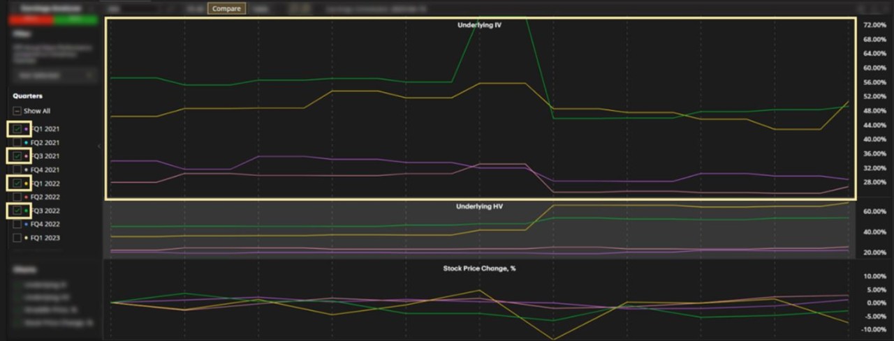
Filter by Beats, Misses or Hits – Click the Filter dropbox to view only those Quarters when reported EPS was higher, lower or the same as Consensus Estimates.

TABLE VIEW. View data for each of the 11 days per Earnings Announcement in table form.

Customize columns – Click the Menu icon.
Next, click Columns Customization.

Available metrics include:
Act EPS
ATM Strdl, %
Est EPS
Hist Vlty, %
Imp Vlty, %
Income
Stock Price
Stock Price, %
Revenue

NOTES. Organize your research notes and trade ideas.
This widget focuses only on notes, whether they are related to particular symbols or just general thoughts and ideas. Keep track of market insights, company research or personal notes.
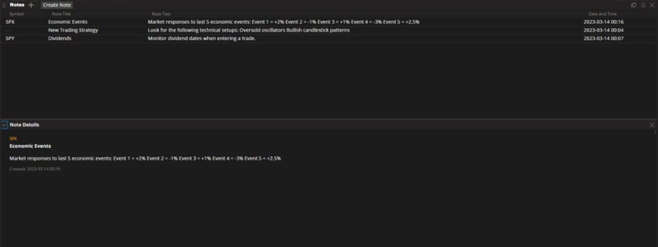
This widget is divided into two sections - Notes and Note Details.
NOTES. A quick list of all active text.
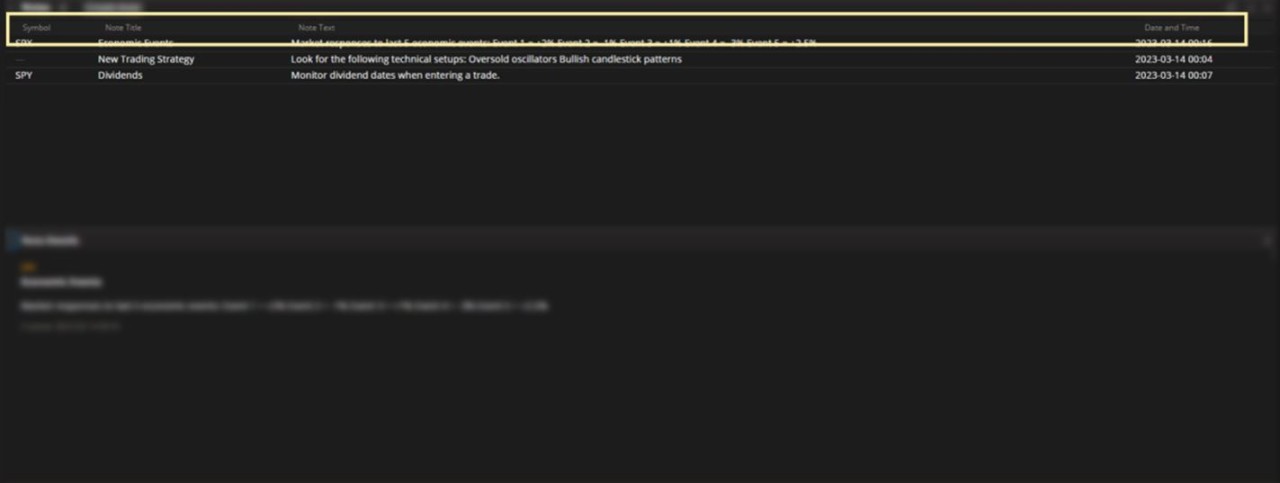
Create a general note (no symbol) – Click Create Note.
Next, enter text and click Create.

Create note for a symbol – From anywhere in the platform, right-click to bring up the action menu and click Notes > Create Note.
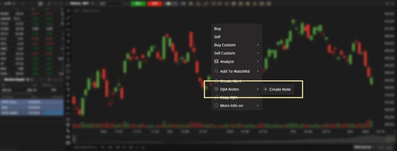
Next, enter text and click Create.

Edit, delete or hide Note Details – Right-click on a note to find these options.

NOTE DETAILS. View expanded content.
View more information – Click a note in your list.

Next, click Note Details in the lower left to expand the Note Details section.

Customize columns – Click the Menu icon.
Next, click Columns Customization.

Choose from the following metrics:
Note Title
Note Text
Date and Time

NEWS. Follow market news directly within TD Active Trader while you trade.
Staying on top of headlines that can potentially move markets can consume time and take away from your trading day. Use the News widget to stream headlines on symbols or indices to gain insight on the day's price action, without having to leave the platform.
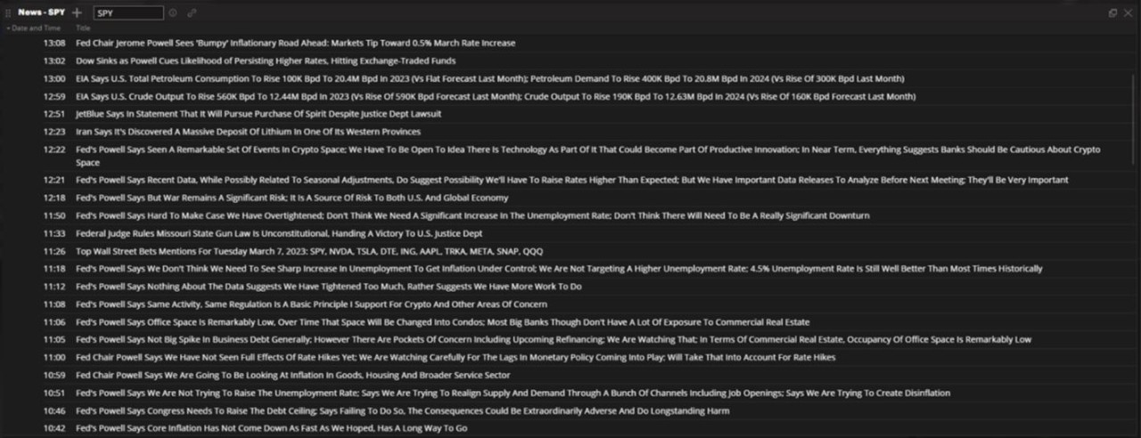
Sources - News is provided by DowJones Newswires, MT Newswire, Benzinga and CNBC.
Filter by symbol – Enter a ticker symbol or select an Index.
TIP: When no symbol is selected (default), all available news will be shown.
Read a story - Click on any headline to expand the story.

Next, scroll up/down the screen to view additional content if necessary (the length of a story will be highlighted with a gold bar on the left).

Close a story - Click on the headline again to minimize the story.

Sort by Date and Time – The most recent article will appear at the top of the list. To change the order, click on the Date and Time column header to toggle between ascending, descending or unsorted order.

CALENDAR. Monitor upcoming market-related events.
Staying on top of events that could potentially move the markets is important. Use the Calendar widget to find upcoming dividend dates, earnings announcements, conference calls, stock splits and economic events, then set up alerts to be reminded of these events in advance.
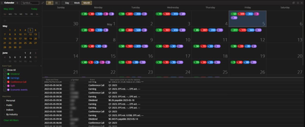
This widget is divided into two sections – Filters and the Calendar itself.
FILTERS. Adjust what time, event type and watchlist the Calendar is showing.
For Month view – Click the date in the upper left.
Next, scroll down the list and left-click to select.
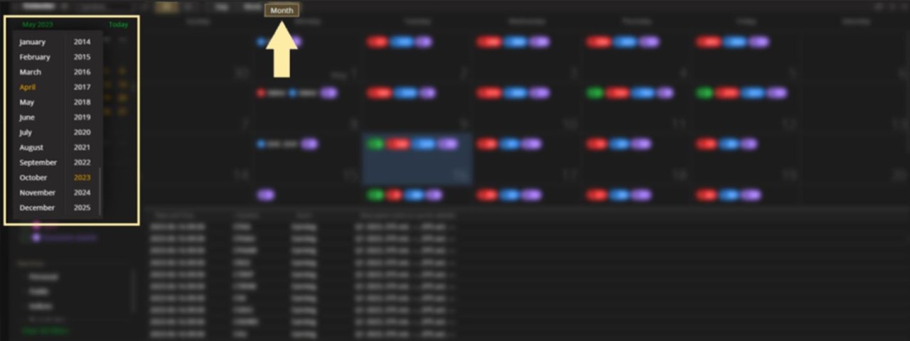
For Week view – Click the date in the upper left.
Next, hover over the week you want to view and click the left mouse button.

For Day view – Click the date in the upper left.
Next, hover over the date you want to view and click the left mouse button.

Filter by event type – Select from the list of events. You will see the corresponding icons in the Calendar area to the right.

Filter by watchlist – Click on the Watchlist filter and make your selection.

Clear watchlist selection – Click on the selected Watchlist or delete the watchlist name in the Symbol box.

Hide filter section - Click on the divider to hide/unhide the filter section.


CALENDAR. View events using a calendar-style format.
Select calendar view – Click the Calendar icon in the upper-left area.

Select date range – Click Day, Week or Month.

View icon details – Click on any icon for a list those events taking place that day.
Close icon window - Click the icon again or click the X in the upper-right section.

View event details – Hover over any headline.
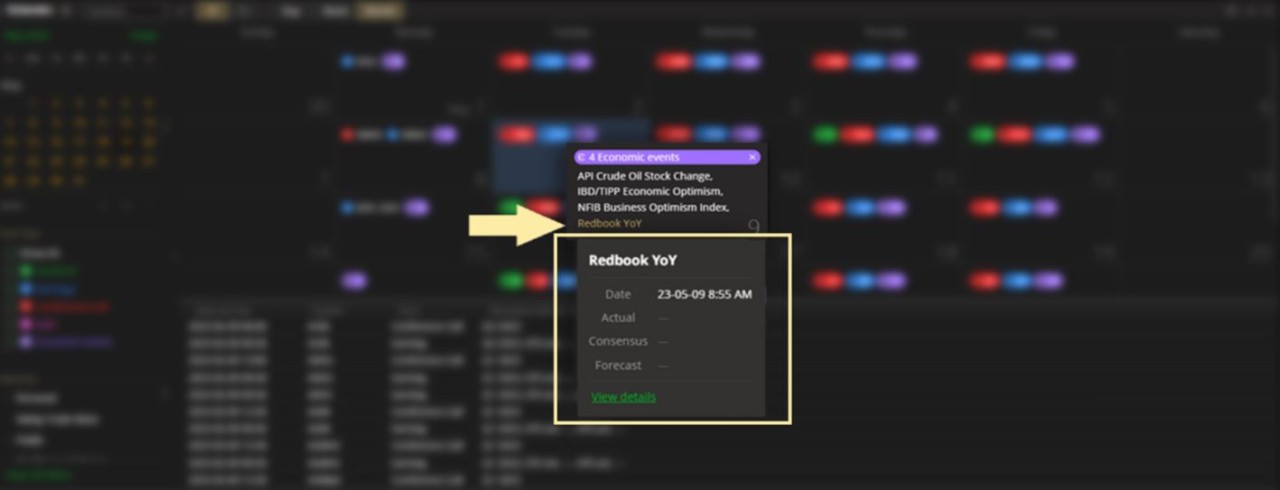
TIP: Clicking View details (if applicable) will take you to an external link that provides further content.

Detailed list – Click on a date on the calendar and view an expanded list of its events below.

View event details – Click on any event to find the same details presented in the previous example.

TIP: Drag the divider (highlighted) vertically to manage screenspace.

Use action menu – Right-click on an event.

Create an alert – Right-click on an event and select Create Alert.

LIST VIEW. Show all events for individual symbols only.
Select list view – Click the List icon in the upper-left area.
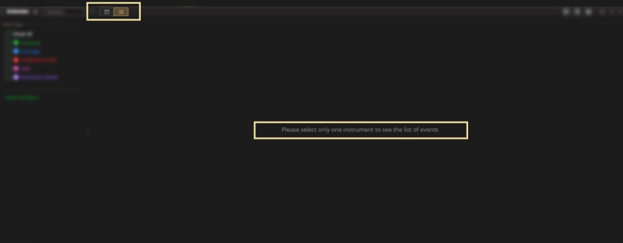
Enter a symbol – Type in a symbol in the upper-left area.
Next, scroll the list to view upcoming and historical (past 5 years) events.

View event details – Click on any headline to expand information.

Use action menu – Right-click on an event.

Create an alert – Right-click on an event and select Create Alert.

HEAT MAP. Glance at the price activity of symbols in a watchlist.
This widget uses three visual parameters – colour, brightness and size. Colour shows direction (green is positive, red is negative). The brighter the colour, the higher the percentage move on the day. The size of the box is determined by the company's Market Cap.
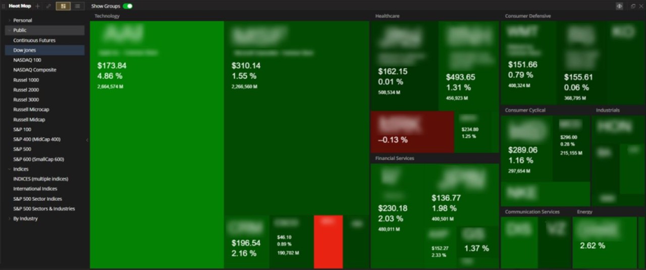
View quote details on a symbol - Hover over any symbol.
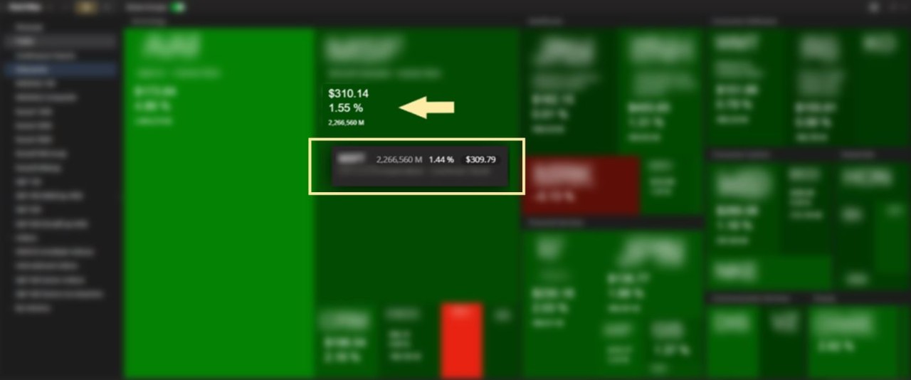
Show action menu – Right-click on a symbol to bring up the action menu.

Choose a watchlist – Click on a watchlist in the left area.

LIST VIEW. View all names in list format.
Use List View – Click the List icon in the upper left.

Sort by Market Cap – Use the sort function at the top of the Market Cap column.
CUSTOMIZATION. There are no further sorting or customization abilities on this widget.
YOUR TD ACTIVE TRADER QUESTIONS, ANSWERED. This section is where you can find more resources to help you get familiar with the platform.
QUICK HOW-TO VIDEOS. Visit this section to find short introduction videos to help you get started on the platform.
DISCLOSURES.
The information contained herein has been provided by TD Active Trader, a service of TD Direct Investing and is for information purposes only. The information has been drawn from sources believed to be reliable. Graphs and charts are used for illustrative purposes only and do not reflect future values or future performance of any investment. The information does not provide financial, legal, tax or investment advice. Particular investment, tax, or trading strategies should be evaluated relative to each individual's objectives and risk tolerance.
TD Direct Investing is a division of TD Waterhouse Canada Inc., a subsidiary of The Toronto-Dominion Bank.
®The TD logo and other TD trademarks are the property of The Toronto-Dominion Bank or its subsidiaries.